This article is a formalized version of Daniel Foch’s live Monthly Market Call. Repetition, audience questions and technical interruptions were removed; arguments, caveats and first-person conclusions were retained and organized by theme. The presentation remains available above. Its editorial slides are reproduced below with source links; the four repeated paid-beta offer slides are omitted from the article gallery.
Five signals that organize the market
- Canadian inflation is cooling, but oil and a weaker dollar can still create short bursts of imported, cost-push inflation.
- The bond market is opening a path for Bank of Canada–Federal Reserve divergence because Canada is slower, more indebted and more rate-sensitive.
- The U.S. AI capital-spending boom supports growth and may keep American rates higher even as AI lowers the cost of knowledge work.
- There is not yet a clean aggregate jobs collapse from AI. The more immediate Canadian housing risk remains unemployment and its lagged effect on mortgage arrears.
- Rent-versus-own economics, migration and record purpose-built rental construction are creating several distinct Canadian housing markets—not one national cycle.
My goal with this market call is to move gradually from the macro forces into the household and property-market consequences. We begin with oil because it can change the inflation print quickly. We then move through bonds and the Canadian dollar, because those markets reveal what the Bank of Canada can realistically do. From there, AI connects the U.S. investment boom to Canadian jobs, jobs connect to mortgage arrears, and household economics connect to ownership, renting and the kind of housing Canada is actually building.
The central idea is that Canada does not have a single housing market or a single clean policy story. A commodity shock can be inflationary and recessionary at the same time. The Federal Reserve can face a hotter economy while the Bank of Canada faces indebted households and unsold condos. AI can eliminate tasks while increasing the value of workers who use it. Ownership can remain culturally desirable while renting is economically superior in the most expensive cities.
Those apparent contradictions are not noise. They are the market. The useful work is to identify which force dominates in each city, household and part of the cycle.
Opening, agenda and podcast
Every chart is preserved from the presentation. Open the linked publisher or primary source beneath each image for methodology and current data.

Daniel Foch’s July 2026 real estate and economic update, presented by Real Estate Magazine, Valery and Homies.

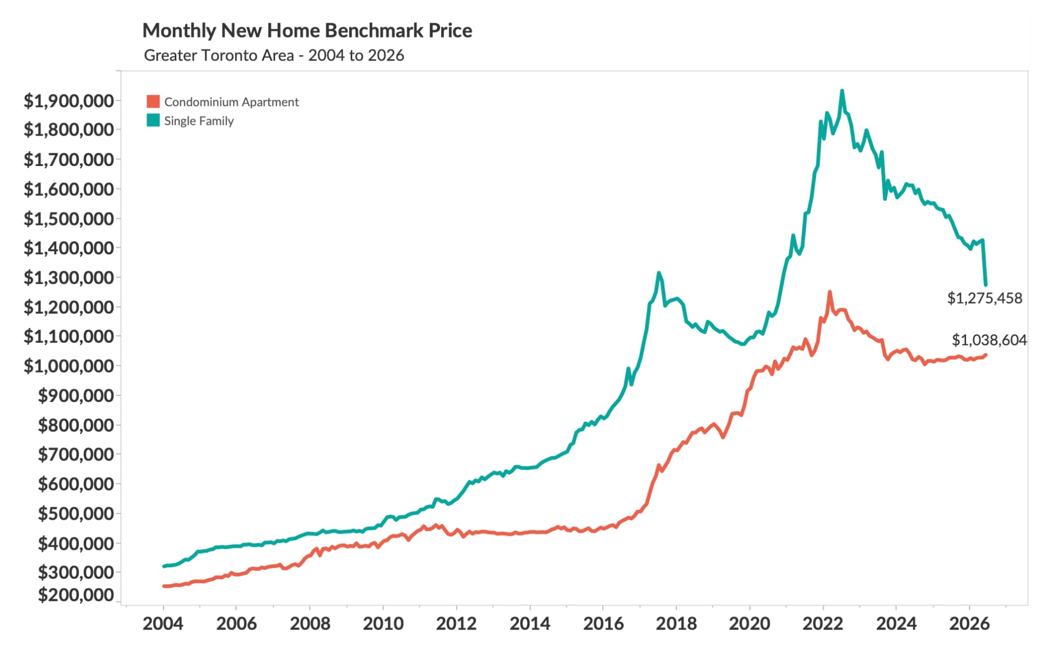
A four-part agenda spanning rates, AI and employment, condo supply, and housing markets—alongside June 2026 GTA new-home benchmarks of $1.28 million for single-family homes and $1.04 million for condominium apartments.

Scan the QR code or open the linked Spotify page to follow The Canadian Real Estate Investor Podcast, then leave a five-star review to help more Canadian investors find the show.
Oil can lift inflation—and destroy the demand needed to sustain it
The first question is not simply whether another oil shock raises the CPI. It is whether households still have enough room to absorb that shock without cutting spending somewhere else.
The cleanest way to understand the July inflation story is to separate the first-round price shock from the second-round economic response. A disruption in the Middle East, a lower buffer in the U.S. Strategic Petroleum Reserve or a sudden increase in Chinese restocking can push crude and gasoline higher quickly. That flows into transportation, distribution, food and travel. It is inflationary at the cash register even if the underlying cause has little to do with Canadian domestic demand.
But the Canadian consumer entering that shock is not the consumer of 2021. Mortgage renewals are still repricing household budgets, rents are high, population growth has slowed and discretionary spending intentions have softened. Retailers can try to pass a higher fuel and freight bill through to customers, but customers can also trade down, delay a purchase, cancel a trip or drive less. At that point an oil shock is doing two things at once: raising the measured price level and weakening the volume of goods and services people can afford to buy.
That is why demand destruction is the more important thesis for the next phase of the cycle. A producer may initially protect its margin by increasing prices. If unit sales then fall, it has to choose between accepting lower margins and losing more volume. The headline CPI can rise during that adjustment, but the broader economy may already be losing momentum underneath it. Monetary policy has to distinguish between persistent excess demand and a temporary supply shock that is actively suppressing demand.
An oil shock can make the CPI hotter while making the consumer—and the economy—colder.
June’s Canadian CPI report gave us evidence on both sides. Headline inflation slowed from the prior month’s pace and five of eight major components decelerated. Gasoline remained an important source of pressure, while travel-related services were still firm. Provincial inflation generally cooled. The mix looks less like a generalized Canadian spending boom and more like a narrow collection of cost and service pressures working through an already constrained household sector.
The exchange rate adds another layer. Canada imports a large share of the finished goods and equipment priced in U.S. dollars. When the Canadian dollar weakens, the same American product becomes more expensive here even if its U.S.-dollar sticker price has not changed. That is imported inflation, and it is one reason the Bank of Canada cannot look only at domestic unemployment or housing when it considers cutting rates.
My base case is therefore not that oil becomes irrelevant. It is that a new oil spike is more likely to accelerate household retrenchment than to restart a durable wage-price spiral. That still creates an uncomfortable period for the Bank of Canada: headline inflation can look worse just as the real economy and the consumer are becoming weaker. The policy error would be to treat every higher gasoline print as evidence that Canadian demand is running hot.
Oil can lift inflation—and destroy the demand needed to sustain it
Every chart is preserved from the presentation. Open the linked publisher or primary source beneath each image for methodology and current data.
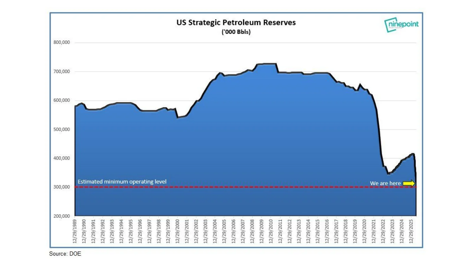
The reserve remains close to its estimated minimum operating level after the sharp 2022 drawdown, leaving less visible buffer against another supply disruption.
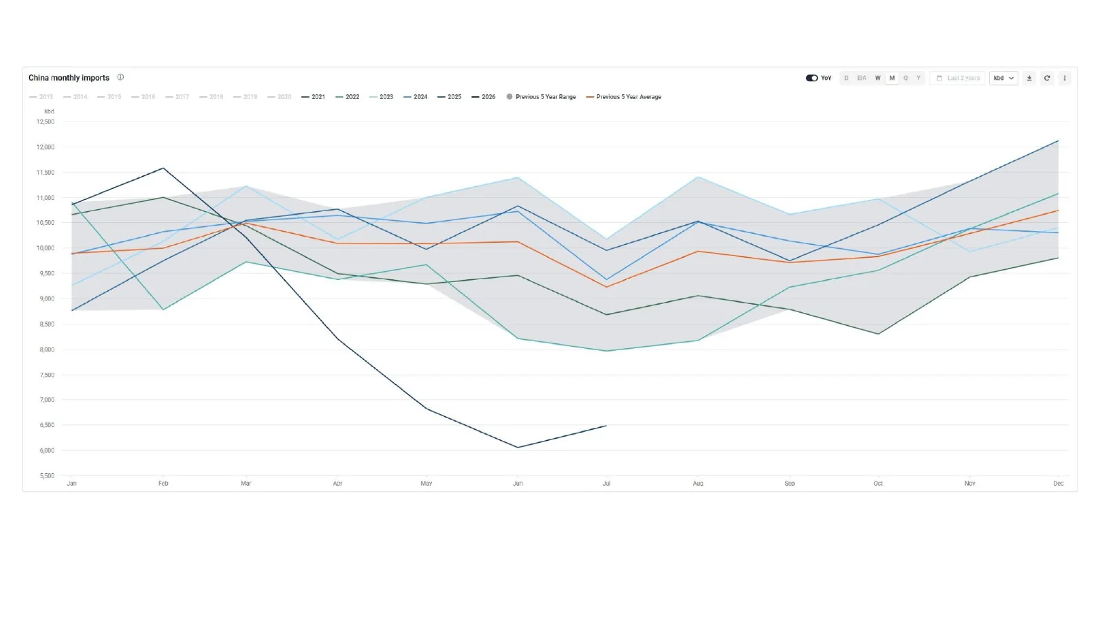
The source-deck chart compares monthly import seasonality across years. The original image does not identify the commodity, unit or data provider, so the source deck remains the reference.
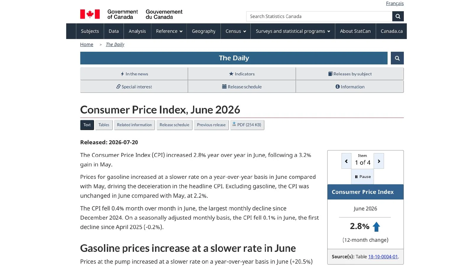
Statistics Canada reported a 2.8% year-over-year increase in the Consumer Price Index in June 2026, following 3.2% in May.
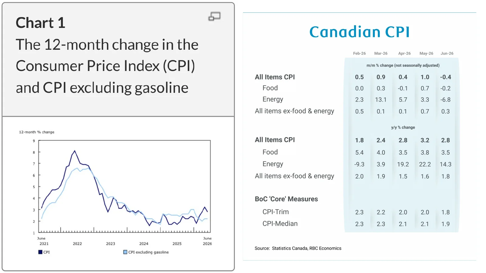
A compact view of headline CPI, energy, food, ex-food-and-energy and Bank of Canada core measures through June 2026.
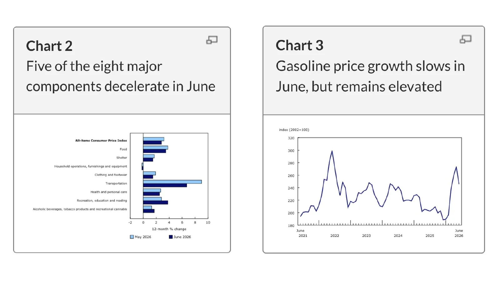
The chart separates June 2026 price changes by major CPI component and compares them with May.
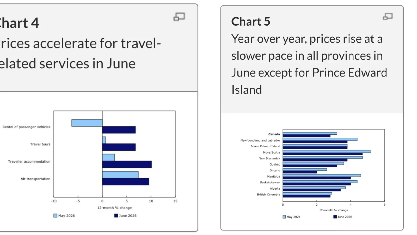
Gasoline inflation remained elevated, travel-related services accelerated and most provinces recorded slower year-over-year price growth in June.
Why the Bank of Canada may not be able to follow the Fed
Canadian and American rates share a global bond market, but the two economies are no longer generating the same growth, inflation or household response.
The Canada five-year bond yield matters because it is one of the most useful market references for fixed mortgage pricing. Over a very short window it had begun to drift lower, even though the one-year view still showed yields near the upper end of their recent range. At the same time, the U.S. 10-year Treasury yield was moving higher. That is an early signal that investors may be pricing different policy paths on either side of the border.
The United States has a powerful domestic growth engine that Canada does not currently share at the same scale: hyperscaler investment in data centres, chips, power, networks and the infrastructure required to run frontier AI. That capital expenditure supports construction, equipment orders, engineering, energy demand and corporate borrowing. It can lift measured productivity over time, but during the buildout it also keeps resource demand and nominal growth hotter than they would otherwise be.
Political pressure for lower U.S. rates does not remove that constraint. A president can publicly prefer cheaper money, but the Federal Reserve still has to respond to employment, inflation expectations and financial conditions. If the AI investment cycle and fiscal impulse keep U.S. demand firm, American rates can remain higher for longer—or even face renewed upward pressure—regardless of the preferred political message.
Canada’s domestic picture is different. Growth is softer, housing activity has already corrected materially in Ontario and British Columbia, and the Bank of Canada itself has called attention to an overhang of unsold condominium inventory in Toronto and Vancouver. Those units are not an abstract financial statistic. They represent investor capital, developer balance sheets, assignment risk, future completions and a pipeline that can weigh on prices and new construction even if resale activity stabilizes.
Canada can need lower rates before the United States does—and still be unable to cut as quickly as its domestic economy would prefer.
The Canadian dollar is where this divergence becomes a policy problem. If the Bank of Canada cuts aggressively while the Federal Reserve stays high, the yield gap can reduce demand for Canadian-dollar assets. A weaker currency makes U.S.-priced imports more expensive and can reintroduce inflation through goods, equipment, travel and energy-linked inputs. The Bank can tolerate some currency movement, but it cannot ignore a depreciation large enough to change the inflation outlook.
There is also an upside cap on how far Canadian rates can reasonably rise. Canadian household debt remains exceptionally high relative to disposable income and compares poorly with other G7 countries. A given rate increase therefore removes more Canadian household cash flow than the same increase would in a less indebted economy. The renewal structure delays part of that effect, which means restrictive policy continues to arrive in household budgets long after the initial hikes.
Put those forces together and the Bank of Canada is trapped between two imported realities: global inflation pressure if commodities rise or the currency falls, and domestic deflationary pressure as indebted households refinance. The most likely outcome is not a perfectly synchronized North American cycle. It is cautious divergence—Canadian yields and policy rates trying to edge lower while the currency, oil and the Fed limit how quickly the Bank can move.
Why the Bank of Canada may not be able to follow the Fed
Every chart is preserved from the presentation. Open the linked publisher or primary source beneath each image for methodology and current data.
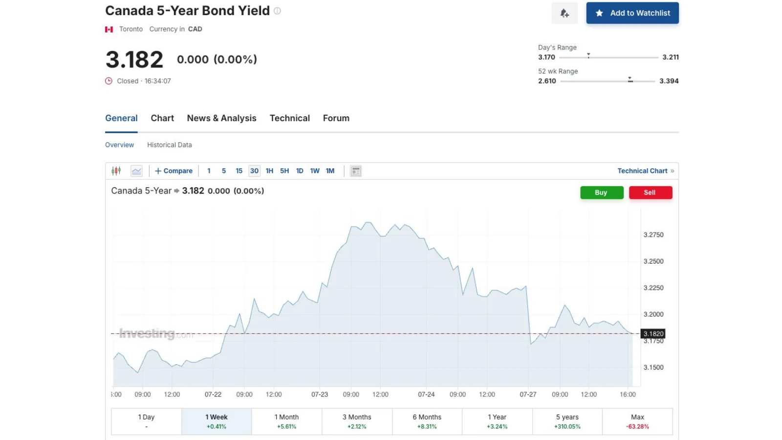
A short-window view of the Canada five-year benchmark, a key reference point for fixed mortgage pricing.
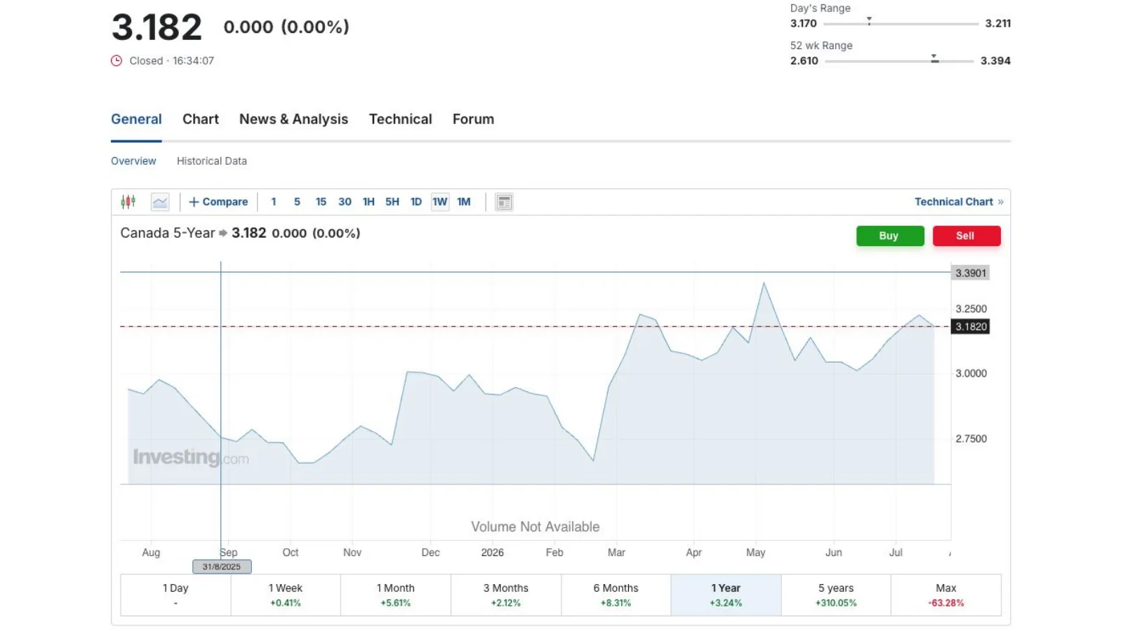
The one-year view puts the late-July yield near the upper end of its 2026 range.
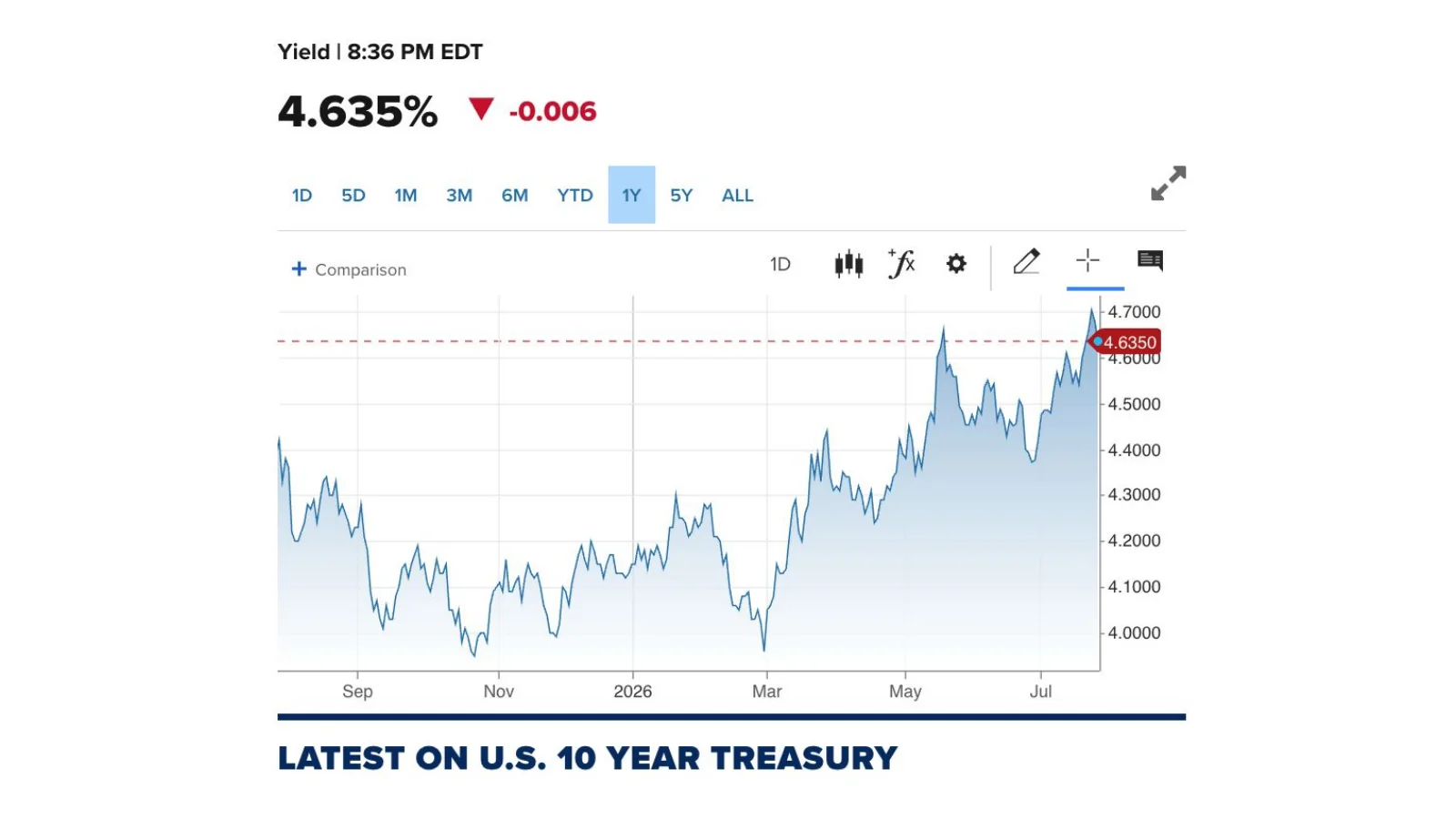
The long-term U.S. benchmark rose sharply into July, tightening global financial conditions and influencing Canadian fixed-income pricing.
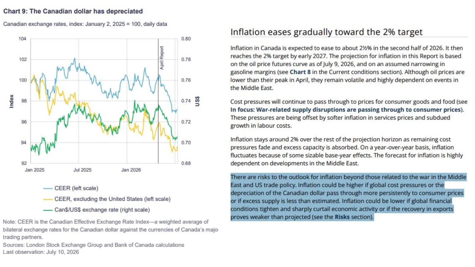
The Bank of Canada projects inflation to ease through the second half of 2026 and reach the 2% target by early 2027, while flagging oil and exchange-rate risks.
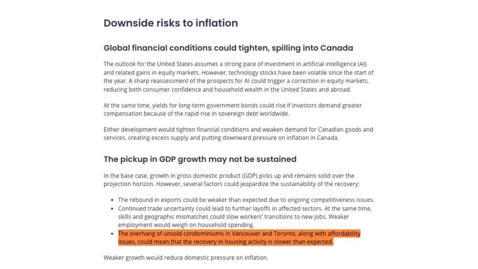
The Bank of Canada highlights tighter global financial conditions and a potentially weaker housing recovery among the downside risks to its base case.

A July 27 Reuters report records President Trump's call for the Federal Reserve to lower interest rates.
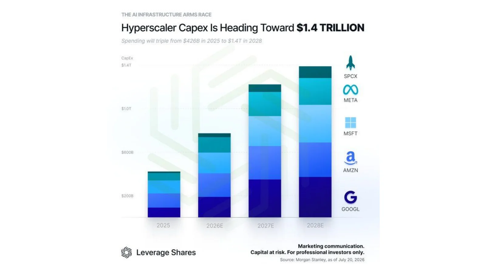
The chart projects a steep increase in aggregate capital expenditure by major AI hyperscalers through 2028.
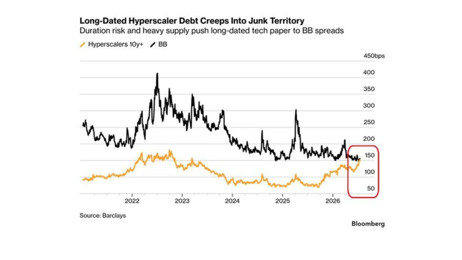
Barclays and Bloomberg data in the source chart show long-duration hyperscaler credit spreads moving closer to high-yield territory.
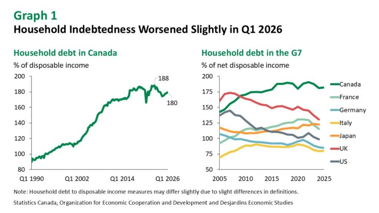
Household debt relative to disposable income worsened slightly in early 2026, and Canada remains the most indebted household sector in the G7 comparison shown.
AI is becoming a productivity layer for real-estate work
The useful question is no longer whether a Realtor has tried a chatbot. It is whether AI can finish a real workflow safely, economically and with the agent still accountable for the result.
McKinsey’s framework for the future real-estate workforce is helpful because it separates physical, digital and intrinsically human work. Some work remains difficult to automate: judgment under uncertainty, relationship-building, negotiation, accountability and physical tasks in the field. Other work happens almost entirely on a computer and can be drafted, researched, reconciled or coordinated by an agentic system. Real estate contains a large amount of both.
That explains why adoption surveys can look impressive while measured time savings still look modest. Many Realtors use AI frequently, but using a chatbot to rewrite a social caption is not the same as redesigning the operating system of a business. The meaningful gains appear when the system can move from an instruction to completed work: prepare a buyer package, summarize documents, coordinate a showing, draft an offer, update a CRM, organize follow-up and present the work for approval.
The constraint is trust. Agents worry about accuracy, privacy, compliance, local market data and whether an AI-generated answer can be used with a client. Those are reasonable concerns. A professional cannot outsource responsibility to a model. The right architecture keeps identity, permissions, business context, tools, memory and approval gates around the model so the model is replaceable but the operating controls remain consistent.
That is the idea behind the LAIRE framework and the Homies harness. The model is the reasoning engine, not the whole employee. The harness determines what the system can see, which tools it can use, what requires human approval and how every action is recorded. If a stronger or cheaper model appears, the business should be able to route work to it without rebuilding the entire system or surrendering custody of protected accounts.
The model supplies intelligence. The harness turns that intelligence into accountable work.
Models still matter. HomieBench tests them against completed Realtor work rather than relying only on broad academic benchmarks. The best model for a detailed transaction document may not be the best value for a quick lead summary; the strongest overall score may not produce the lowest cost per successful outcome. Model routing therefore becomes a business decision: use enough intelligence to finish the job reliably, but do not pay frontier-model prices when a smaller system can complete the same controlled task.
The economic comparison is not AI versus a perfect human. It is the marginal cost, turnaround time and error rate of a supervised AI workflow compared with the way the work is currently done. A virtual assistant or coordinator provides broad capability but adds fixed payroll and management. AI turns more of that cost into a variable expense. That can make high-quality preparation available on small or irregular tasks that never justified a dedicated hire.
There is an important creative limit. I use AI to research, pressure-test structure and sharpen an opening, but I do not want it to erase the way I actually speak. The advantage compounds when the system learns your preferences and you become better at directing it. Beginners do not need a complicated stack on day one. Start with a good general model, use it on real work, inspect the mistakes and gradually build repeatable workflows around the places where it earns trust.
For Realtors who want to test that workflow model directly, Homies is opening a paid beta. The appropriate promise is not autonomous real estate. It is a supervised AI team that can prepare and coordinate more of the work while the licensed professional remains in control. The beta is also how we learn which tasks deserve deeper integrations and which still need a person from the first step.
AI is becoming a productivity layer for real-estate work
Every chart is preserved from the presentation. Open the linked publisher or primary source beneath each image for methodology and current data.
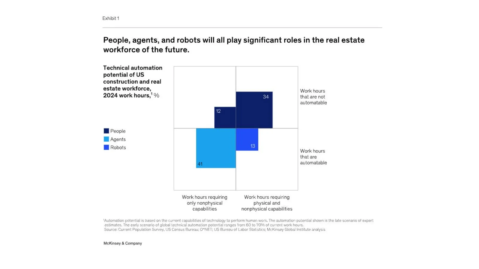
McKinsey estimates that AI-enabled agents and robots could automate substantial shares of construction and real-estate work hours, while people retain non-automatable work.
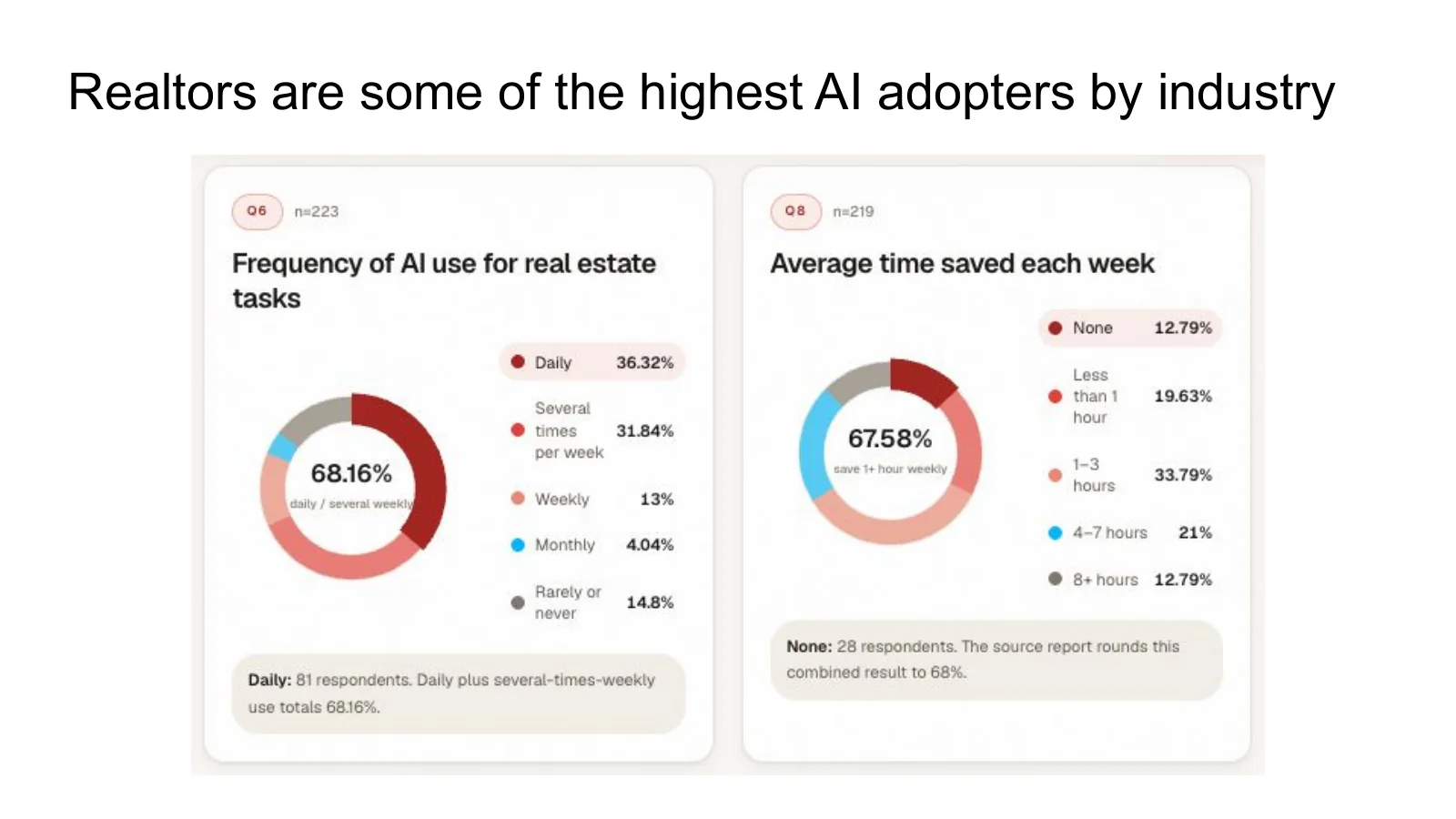
In the source survey, 68.16% of respondents reported daily or several-times-weekly use, while 67.58% reported saving at least one hour per week.

Homies' capability-without-custody framework provides a governance model for safe, compliant and responsible agentic AI in real estate.
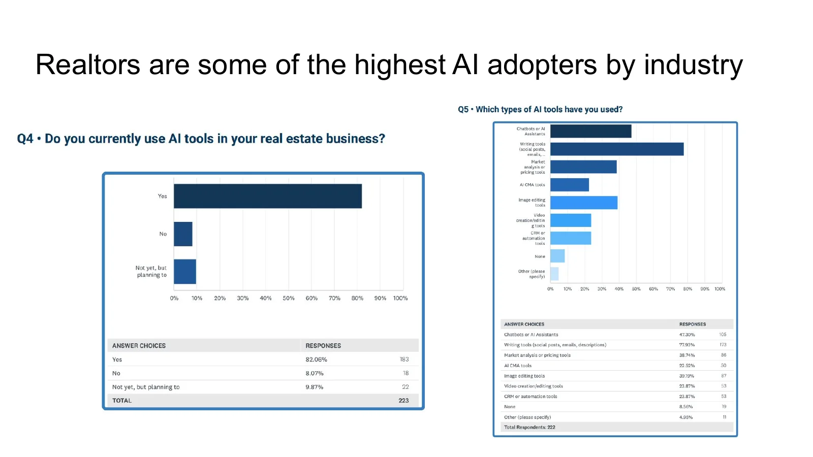
The source survey reports broad adoption, with chatbots and assistants leading a mix of marketing, research, analytics and workflow tools.
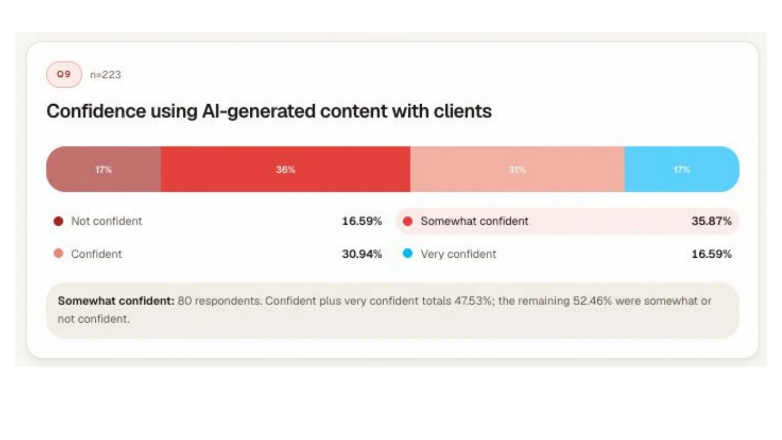
Respondents see value in time savings and communication, but still report concerns about accuracy, compliance, market-data integration and the learning curve.

The market call turns to the model layer and the frontier systems compared in HomieBench v4.

HomieBench compares ten AI models across 100 realtor workflows and includes completed-job economics, not just abstract benchmark scores.

The Homies product position connects model capability with a role-based AI team that handles concrete real-estate work.

The HomieBench harness keeps the business context, tools, memory, permissions and human approval gates constant while models change.

The results view combines overall quality, category leadership, finished-job economics and interactive role-specific rankings.
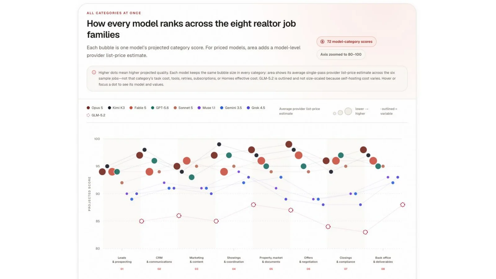
Category performance varies: the strongest overall model is not necessarily the best or most economical choice for every real-estate workflow.
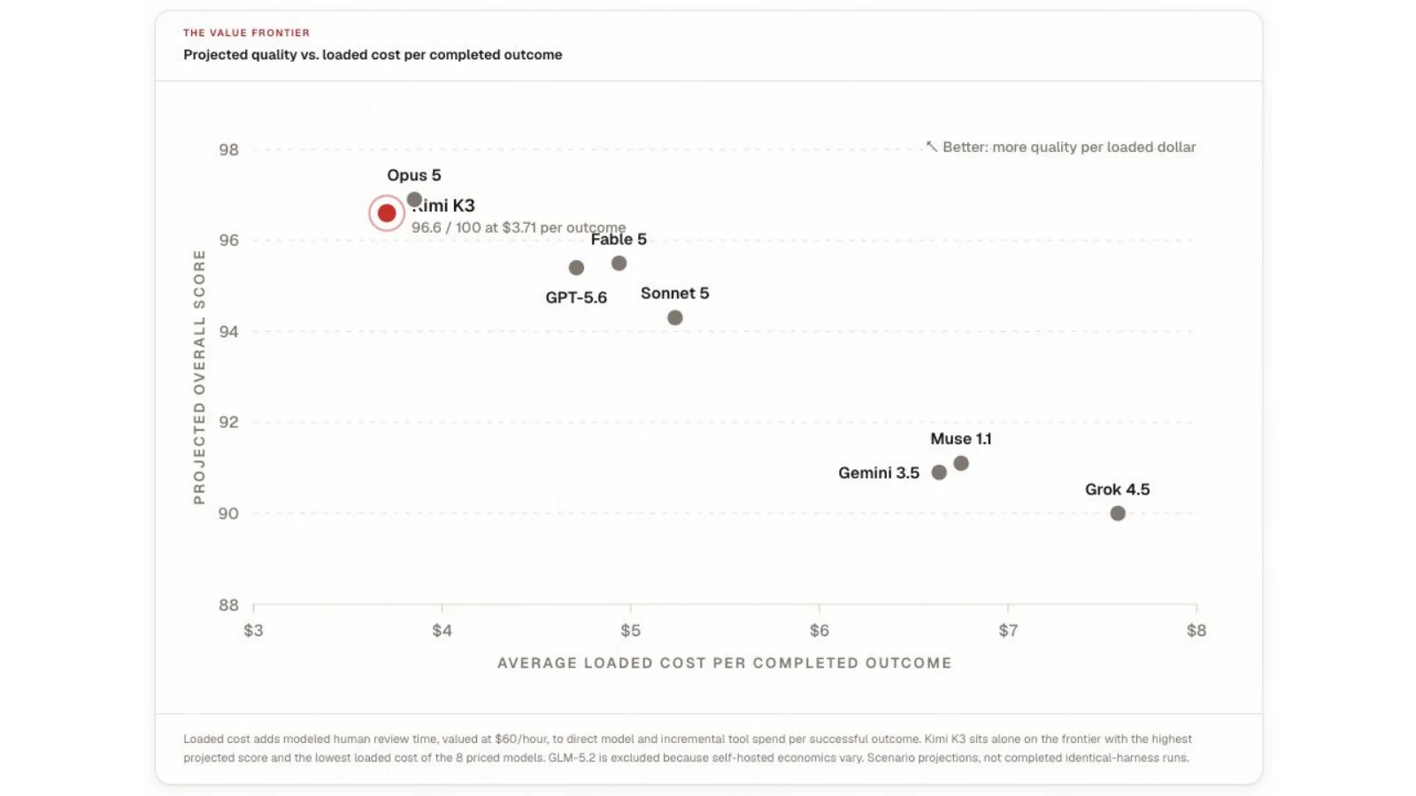
The value frontier compares projected overall quality with loaded cost per completed outcome, making model routing an economic decision.
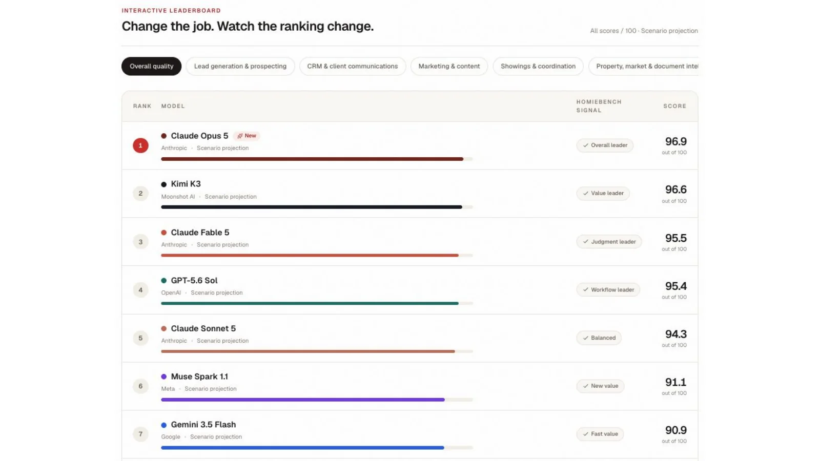
HomieBench exposes role-specific rankings instead of pretending one model wins every workflow.
Jobs still matter more to mortgage arrears than the AI narrative does
AI is changing tasks quickly, but the housing transmission mechanism remains familiar: when unemployment rises and income disappears, mortgage stress follows with a lag.
Canada’s unemployment rate eased to 6.5% in June, while employment was little changed. That improvement needs to be read carefully. The unemployment rate is a ratio, so slower population growth or people leaving the labour force can improve the headline even without a powerful hiring cycle. The employment level, participation rate, age mix and population denominator all matter when we decide whether the labour market is genuinely strengthening.
For housing, the key chart is the long-run relationship between unemployment and mortgages in arrears. Arrears are far less volatile and operate on a delay. A household can absorb an income interruption with savings, severance, credit or help from family before missing enough payments to enter the formal arrears data. That means a turn in unemployment usually appears before the full mortgage-loss signal. It also means today’s arrears rate can understate stress already developing in household budgets.
The first place many people expected AI disruption to appear was entry-level and youth employment. June’s student data did not produce a simple collapse story: the summer job market improved from a year earlier, although it remained weaker than the pre-pandemic norm. Reduced growth in non-permanent residents may also be changing competition for the same accommodation, food-service and junior roles. We should not attribute every improvement or decline in youth employment to AI when immigration and labour supply are moving at the same time.
Industry details reinforce that caution. Accommodation and food services added employment, while manufacturing and several goods-producing sectors were weaker. Tariffs, the exchange rate, regional population flows and the industrial mix along the Ontario–U.S. corridor can all dominate an industry’s hiring decision. AI exposure is one variable in a much larger labour-market equation.
AI may change the job, but income loss is still what turns a labour-market story into a mortgage-arrears story.
The cost of machine intelligence is nevertheless falling at an extraordinary rate. As inference becomes cheaper, more businesses can afford to apply AI to routine analysis, drafting, code, service and administration. That changes the composition of work even if it does not immediately reduce aggregate employment. The same technology can substitute for a task, raise the output of the person doing the job and create demand for complementary work at the same time.
The a16z charts in the deck make the most useful near-term point: there is not yet a statistically clean aggregate relationship between industry AI adoption and unemployment or employment growth. In their comparison, more augmented roles have performed better than roles framed as readily substituted. That evidence is early and should not be treated as proof that no displacement will occur. It is evidence against declaring a broad job apocalypse before it appears in the data.
Programming offers a good analogy. AI can generate large amounts of code, but production software still needs architecture, testing, deployment, security, integration and accountability. A capable programmer who uses AI may become more valuable because the programmer can finish more work. Real estate can evolve similarly: automate preparation and coordination, then concentrate human time on judgment, trust and client outcomes.
My housing conclusion is therefore narrower than either the optimists or pessimists want. AI will eliminate some tasks, reorganize many roles and make strong operators more productive. But the immediate Canadian mortgage-risk dashboard should still begin with employment, household cash flow and renewals. If unemployment turns higher again, arrears are likely to follow later—regardless of whether AI was the original cause.
Jobs still matter more to mortgage arrears than the AI narrative does
Every chart is preserved from the presentation. Open the linked publisher or primary source beneath each image for methodology and current data.
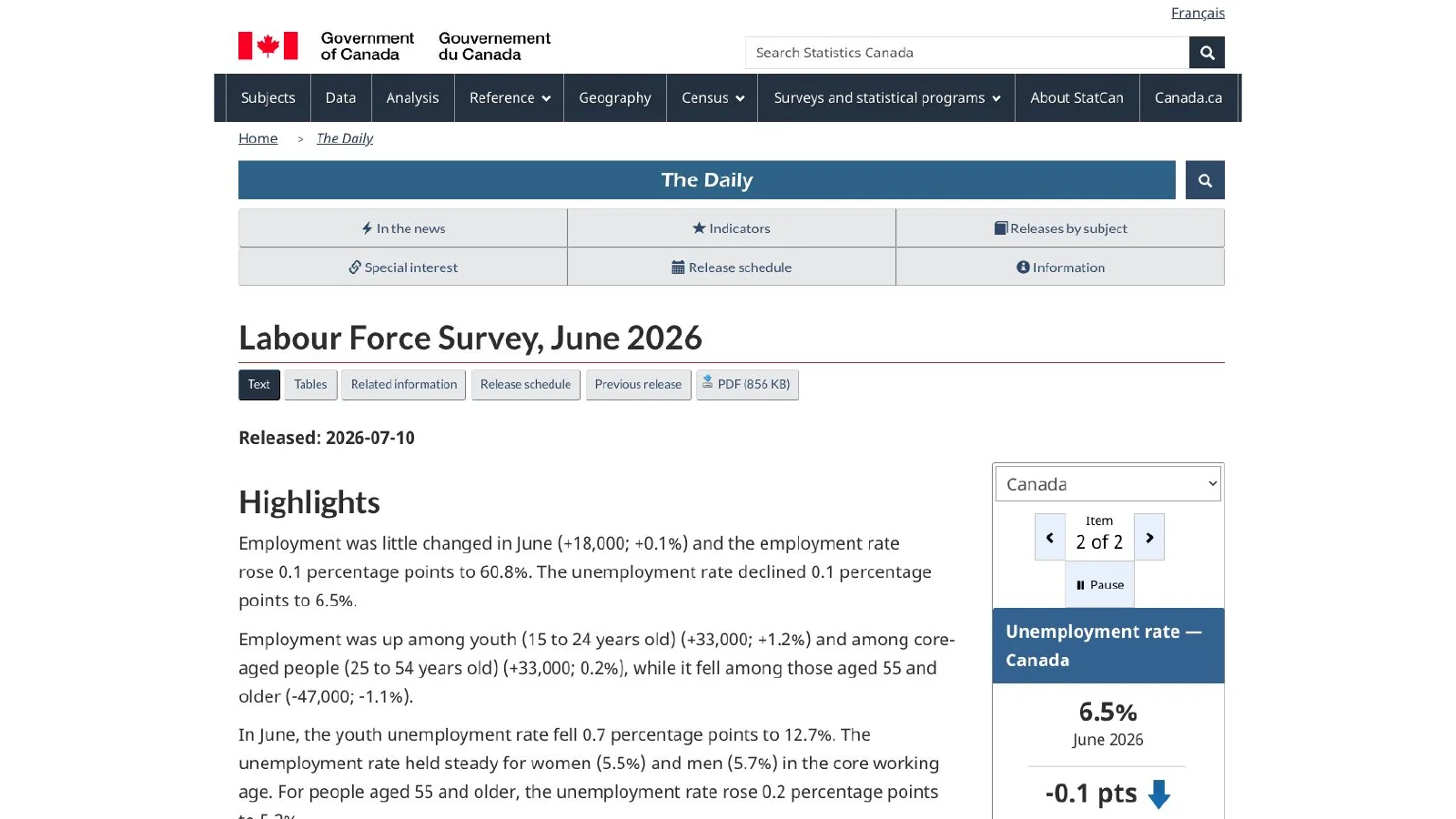
Employment was little changed in June 2026 and the national unemployment rate fell 0.1 percentage points to 6.5%.
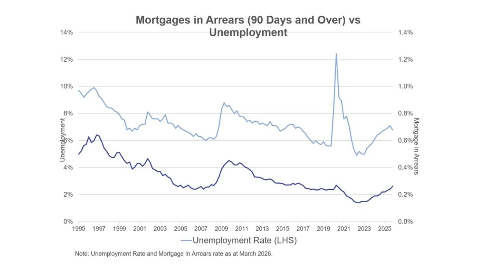
The long-run comparison shows mortgage arrears moving with a lag and at a much smaller scale than unemployment, with both still far below their 2020 spike.
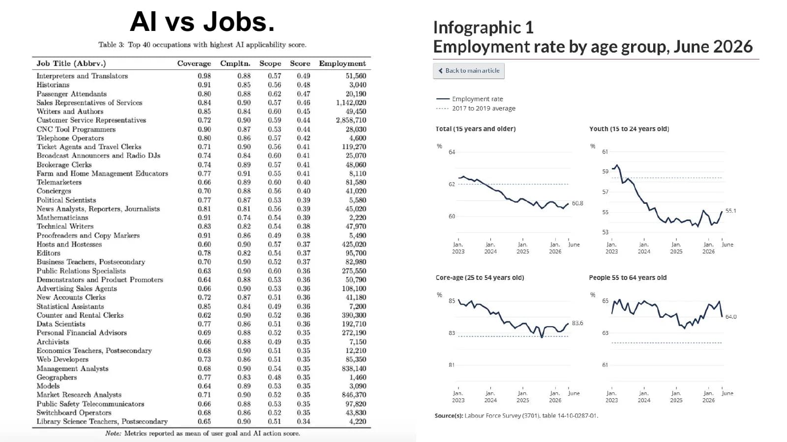
OpenAI's occupation-exposure research sits beside Statistics Canada's June 2026 employment-rate trends by age group.
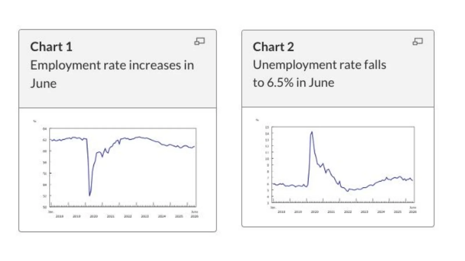
Statistics Canada reported an employment rate of 60.8% and an unemployment rate of 6.5% in June 2026.
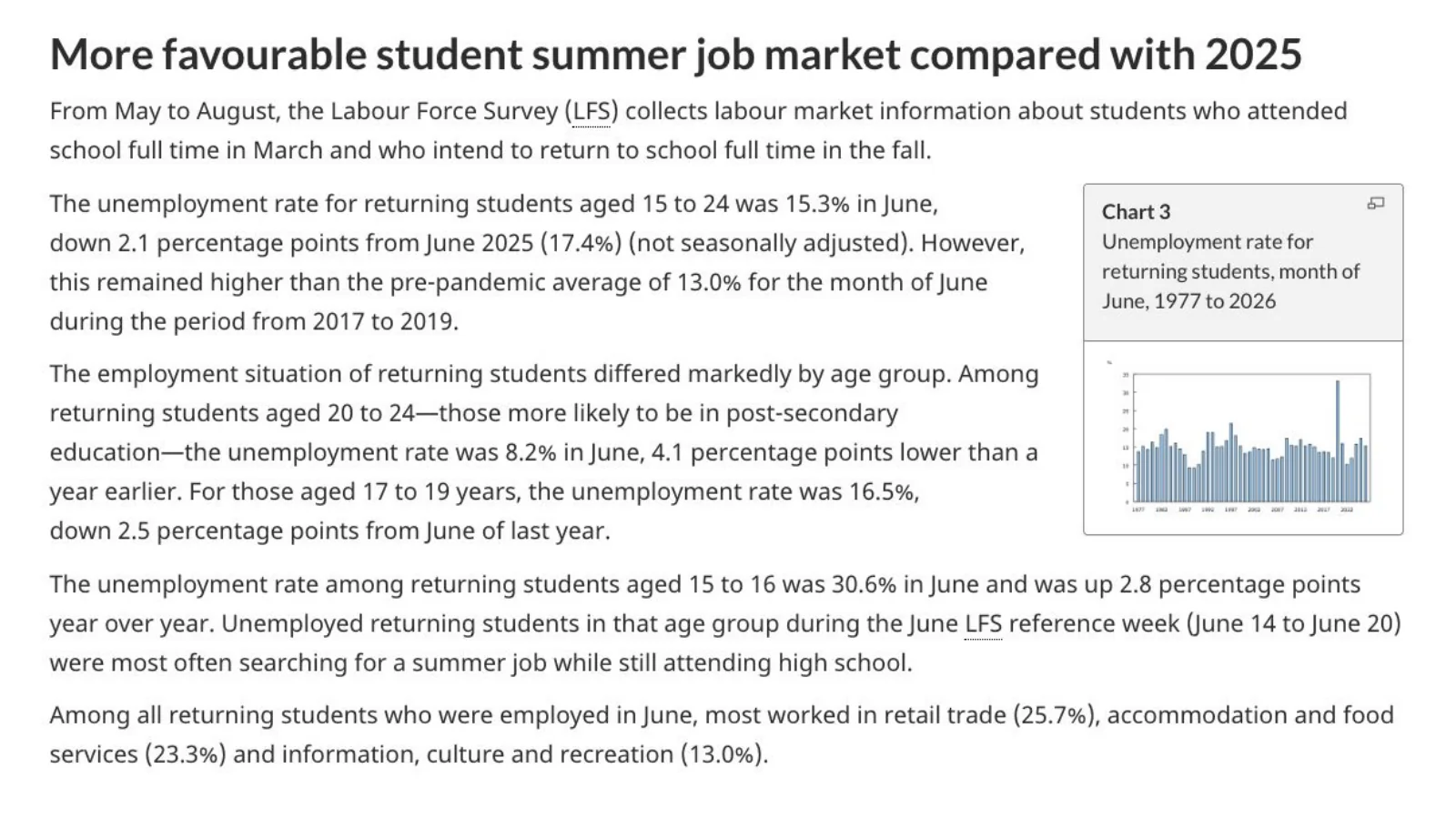
Returning students aged 15 to 24 had a lower unemployment rate than a year earlier, though conditions remained softer than the pre-pandemic average.
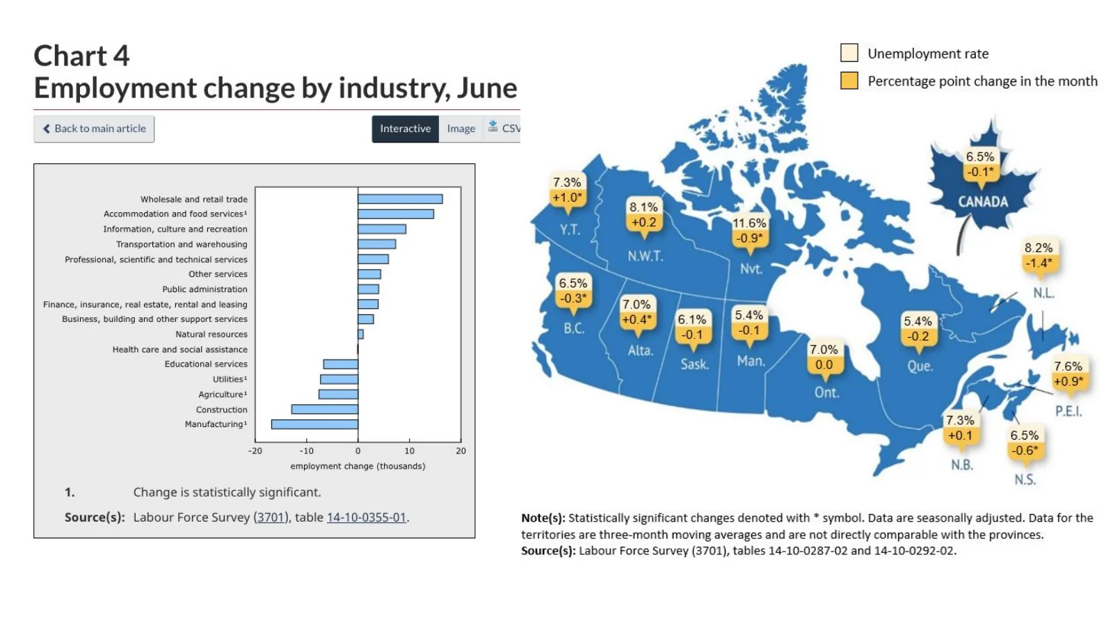
June employment gains were led by accommodation and food services, while manufacturing and several goods-producing sectors declined; provincial rates remained uneven.
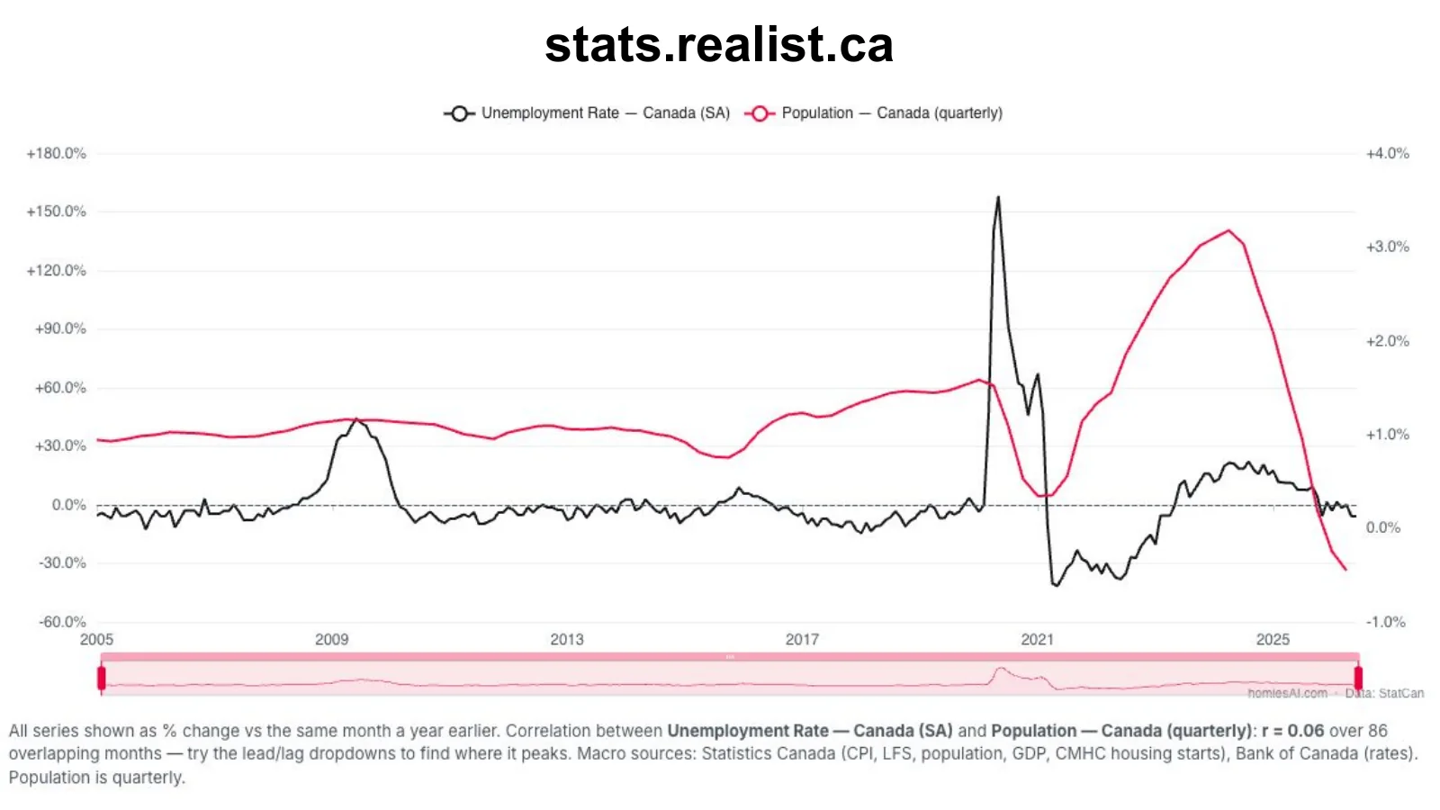
The Realist chart compares year-over-year changes in Canada's unemployment rate and population using Statistics Canada series.
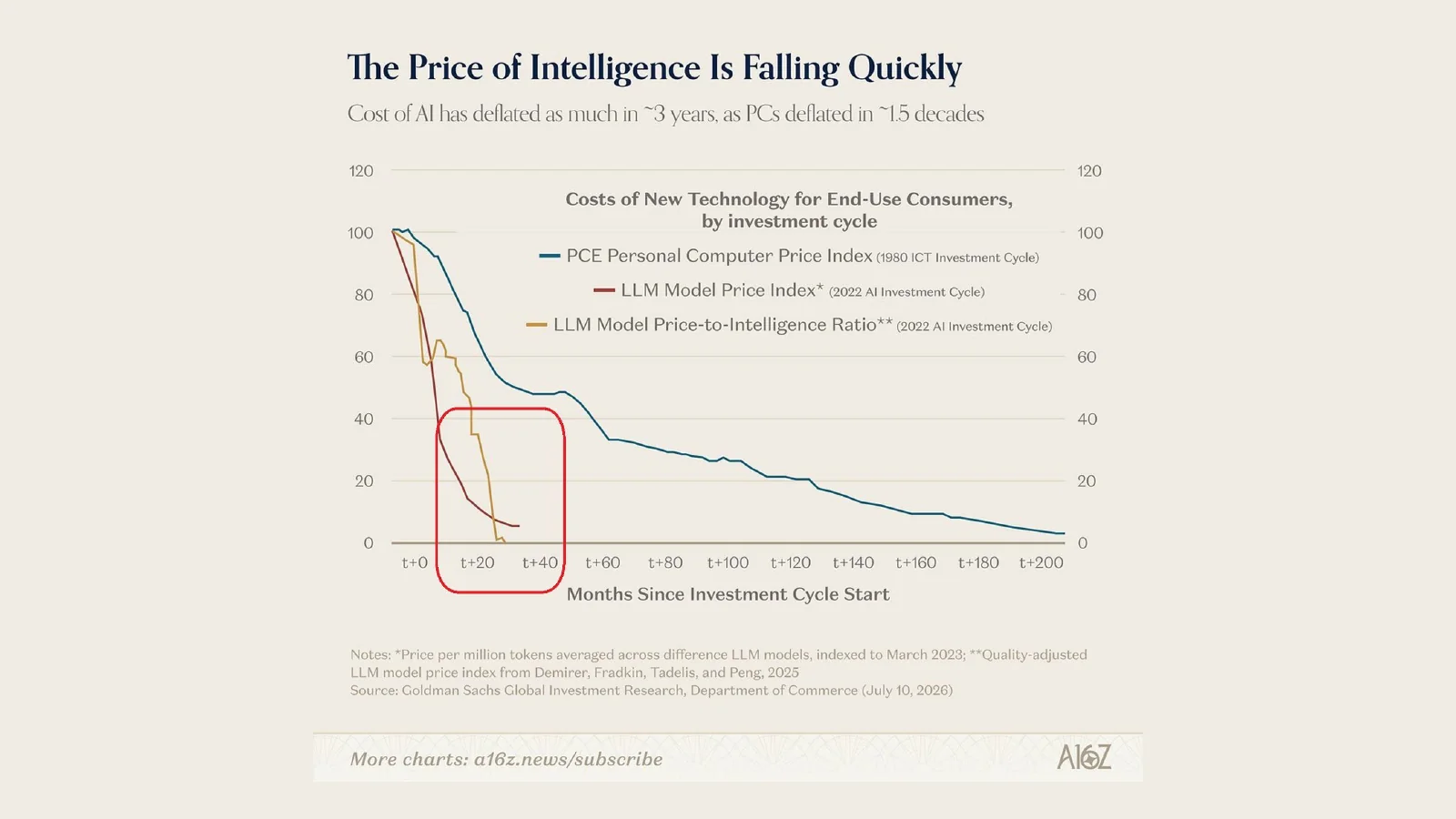
The chart argues that LLM price deflation has occurred far faster than the personal-computer price decline during the earlier ICT investment cycle.
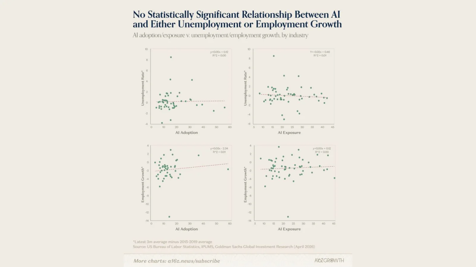
The cited industry-level analysis finds no statistically significant relationship between AI adoption and either unemployment or employment growth.
The ownership rate is lower than it looks—and the incentives explain why
A household can live in an owner-occupied home without every adult in that home owning property. That distinction changes how we think about young adults, pent-up demand and the growth of renting.
The traditional homeownership statistic measures whether a housing unit is owner-occupied. It does not tell us how many adults in that unit personally own the home. A 30-year-old living with parents in their owner-occupied house is counted inside an owner household even if that person has no ownership interest. The Minneapolis Fed’s homeowners-to-population measure was created to expose that difference.
The gap is especially important for younger adults. When housing costs rise, more people delay forming an independent household, live with parents longer or share space with an owner. The traditional rate can therefore look stable while the share of adults who personally own is falling. The U.S. evidence shows a larger decline for younger groups and a wider measurement gap in higher-cost states.
Canada does not yet have an identical national HPOP series in this deck, so the U.S. result should be used as a lens rather than imported as a Canadian estimate. Canadian census tenure is also household-based, and the visible rise in young adults living at home points in the same direction. The practical implication is that Canada may have fewer individual owners—and more long-duration renters or non-owner adults—than the headline owner-occupied share suggests.
That does not automatically create a spring-loaded wave of buyers. Desire is not the same as effective demand. A household must be able to assemble a down payment, qualify under the stress test and carry the monthly cost. If renting a comparable home is materially cheaper, delaying ownership can be a rational economic response rather than a temporary failure to launch.
In the markets where people can afford to buy homes, more people buy homes. Economic incentives are not a footnote—they are the market.
National Bank’s city comparisons make the incentives visible. In Toronto and Vancouver, the representative mortgage payment on a two-bedroom condo remains well above average rent. Montréal also retains a meaningful ownership premium. Calgary is closer to parity, while Ottawa–Gatineau and Edmonton have periods where the representative rent is similar to or higher than the mortgage payment. Down payments, taxes, condo fees, maintenance and transaction costs still matter, but the direction of the monthly incentive is clear.
People respond to those incentives both within and between provinces. Alberta recorded the strongest net interprovincial inflow in the chart, while Ontario recorded the largest outflow. At the same time, provincial prices have diverged sharply from their January 2022 levels. Ontario and British Columbia remain below that benchmark in the deck; several Prairie and Atlantic markets are above it. Canada is not moving through one synchronized housing recovery.
The local leaderboards tell the same story. More affordable markets in the Prairies and Atlantic Canada produced some of the strongest year-over-year price gains. Sales volumes in Toronto and Vancouver can rebound from depressed levels without immediately recreating the prior price peak. Turnover often stabilizes before price, and more transactions can encourage more owners to list, which rebuilds supply at the same time demand returns.
That is why I expect a gradual recovery in the most expensive markets rather than a slingshot. Prices have adjusted, but the monthly carrying-cost premium has not disappeared. The strongest near-term ownership demand should continue to appear where incomes, prices and financing costs allow a buyer to convert preference into a transaction.
The ownership rate is lower than it looks—and the incentives explain why
Every chart is preserved from the presentation. Open the linked publisher or primary source beneath each image for methodology and current data.
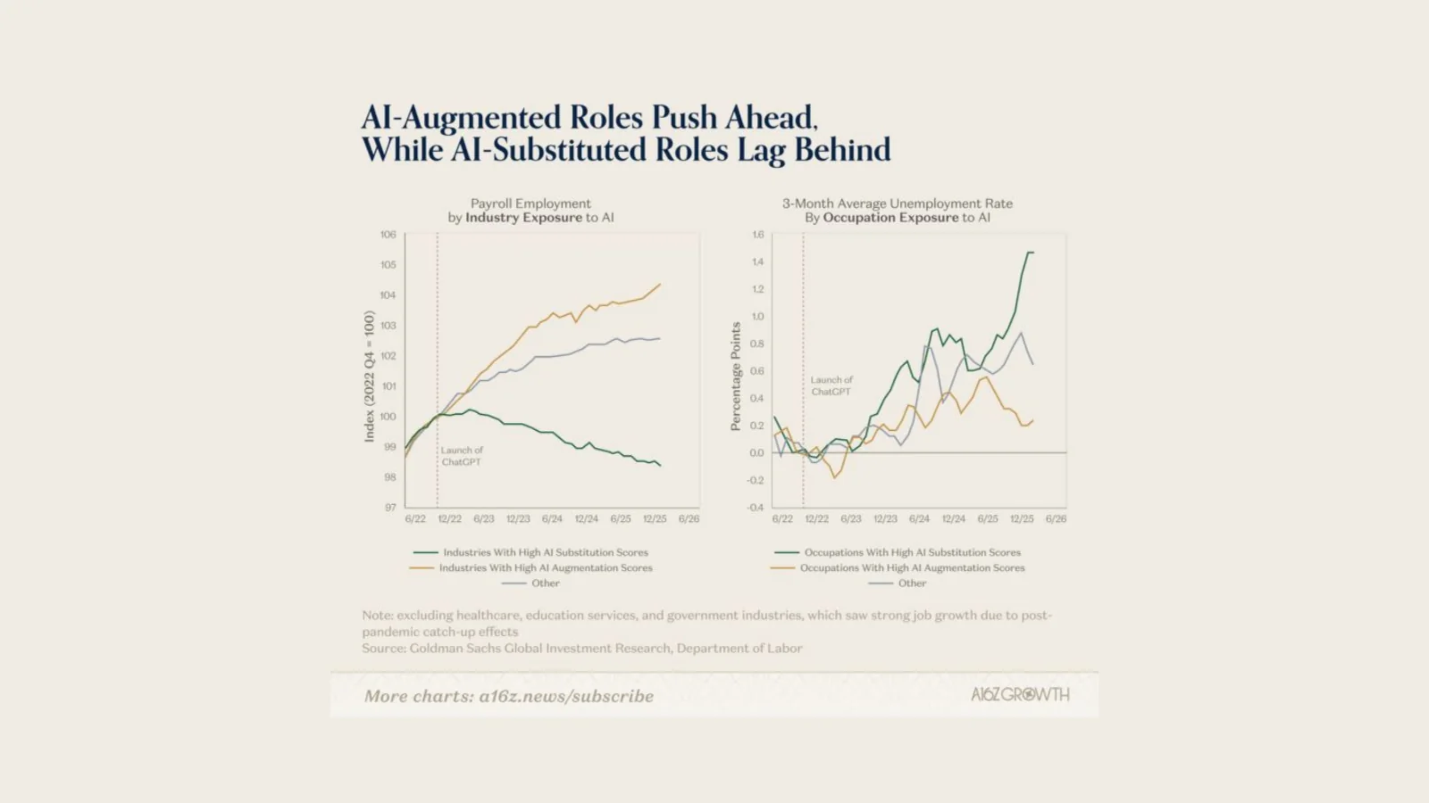
The chart shows stronger payroll growth and lower unemployment in AI-augmented industries than in roles considered more exposed to substitution.
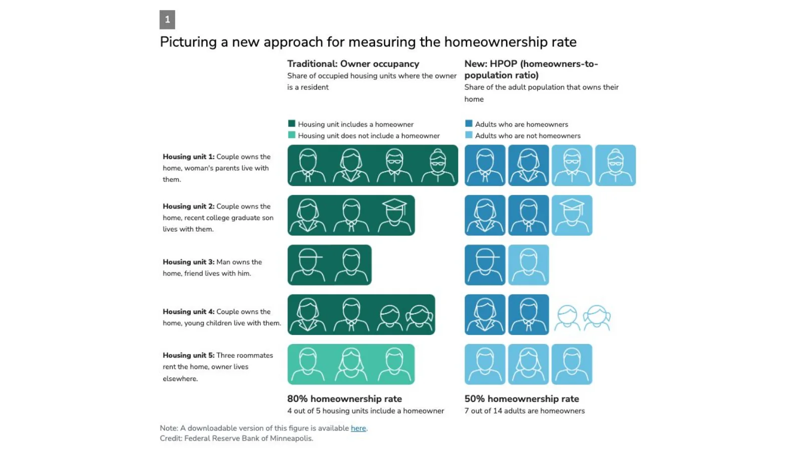
The Minneapolis Fed's homeowners-to-population ratio counts adults who own their home, not simply owner-occupied housing units.
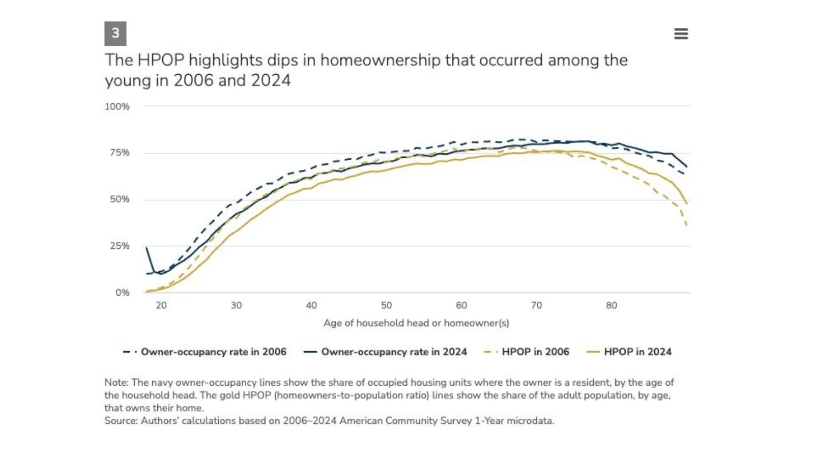
The Minneapolis Fed's HPOP series shows sharper declines among younger adults between 2006 and 2024 than the traditional owner-occupancy measure.
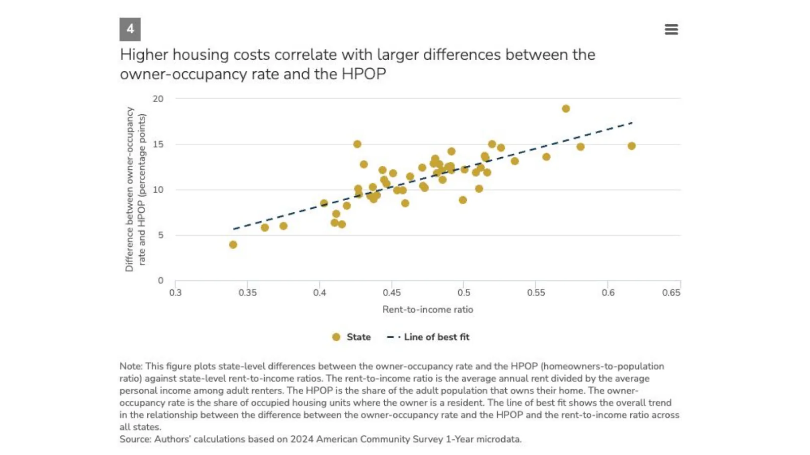
Across U.S. states, higher rent-to-income ratios correlate with larger differences between the owner-occupancy rate and the homeowners-to-population ratio.
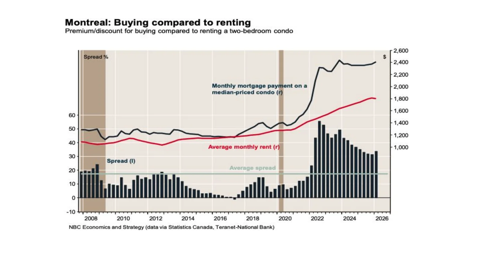
National Bank compares the mortgage payment on a median-priced two-bedroom condo with the average rent for a comparable unit.
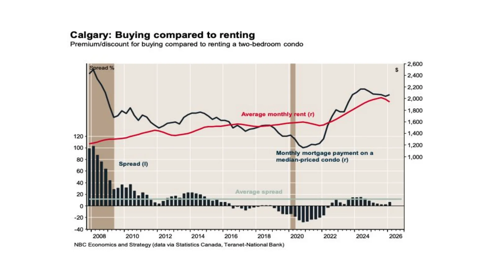
The Calgary spread between a representative condo mortgage payment and rent has narrowed considerably from earlier peaks.
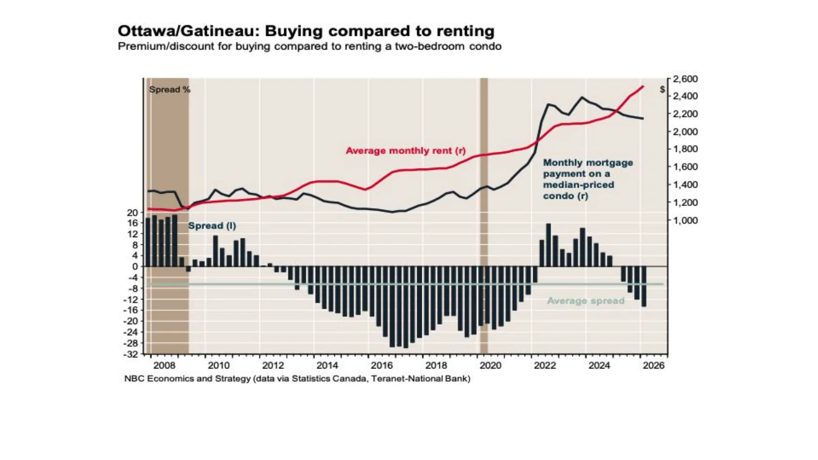
In Ottawa-Gatineau, rent has recently moved above the representative monthly mortgage payment in the National Bank comparison.
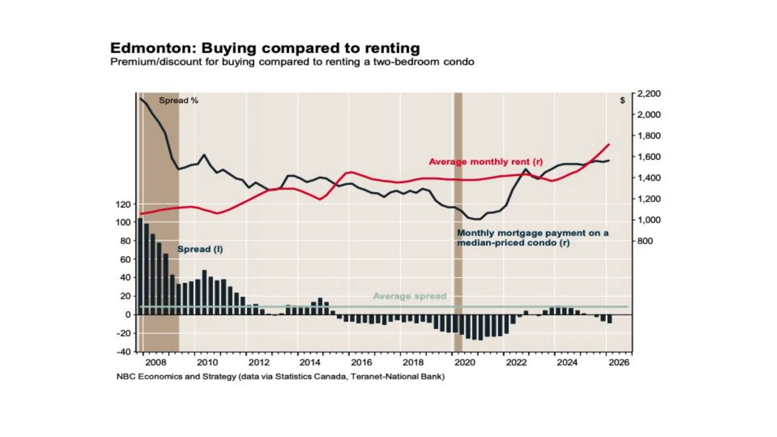
The Edmonton buy-versus-rent spread has moved close to balance after a long period in which mortgage payments exceeded rents.
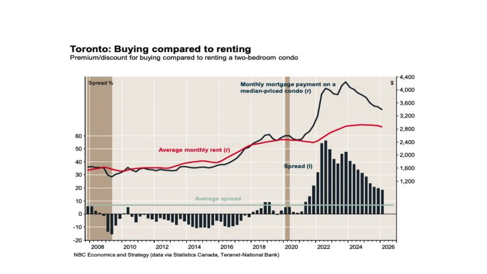
Toronto's representative condo mortgage payment remains materially above average rent, although the spread has narrowed from its recent peak.
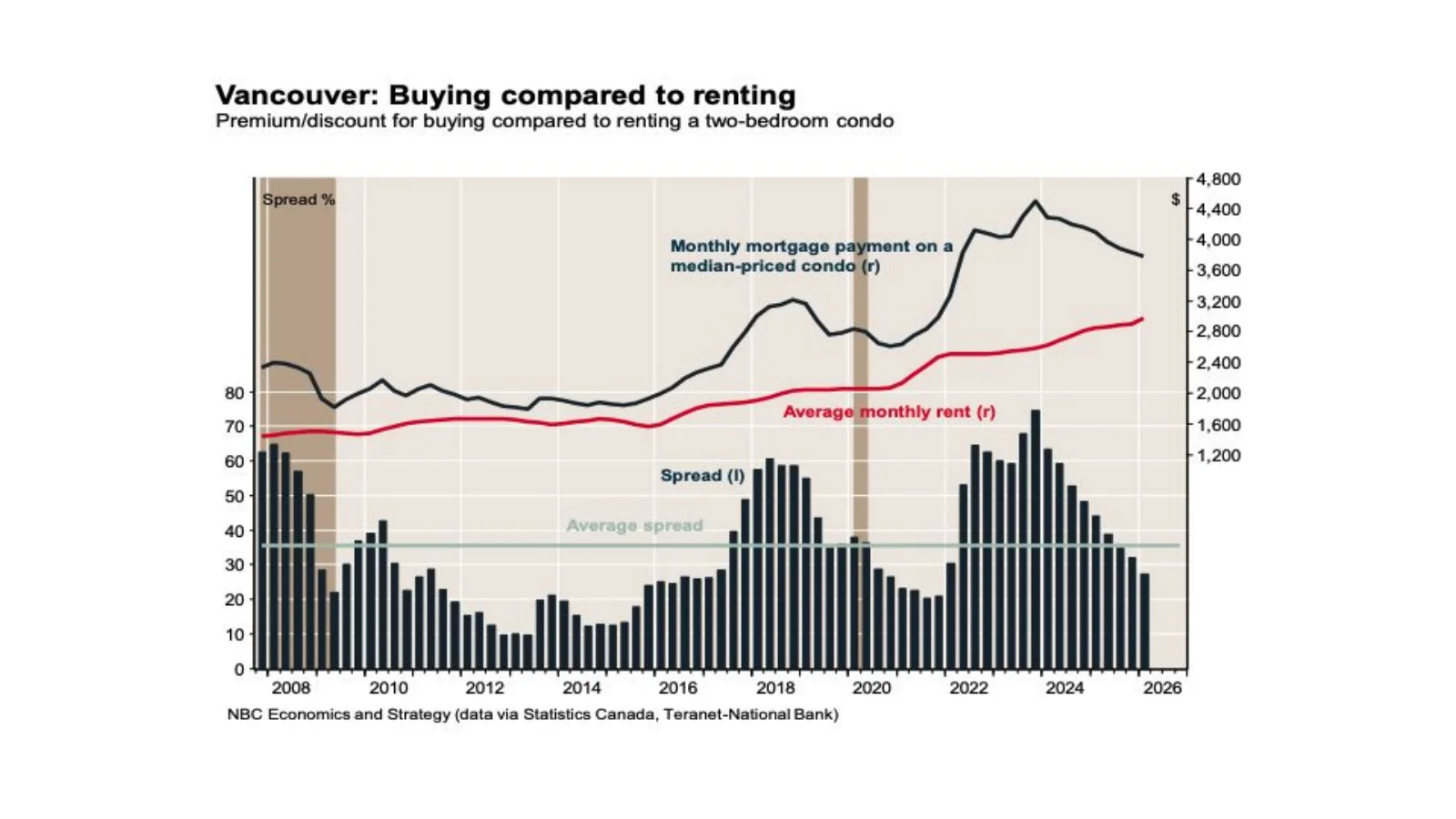
Vancouver retains a large premium for buying a representative condo rather than renting, even after the spread eased from its peak.
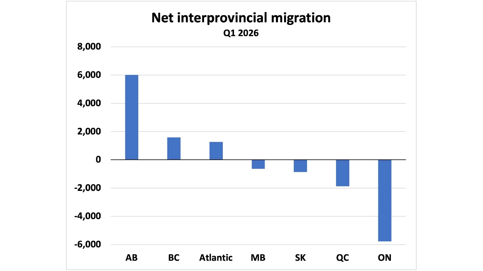
Alberta recorded the largest net inflow in the chart, while Ontario posted the largest net outflow.
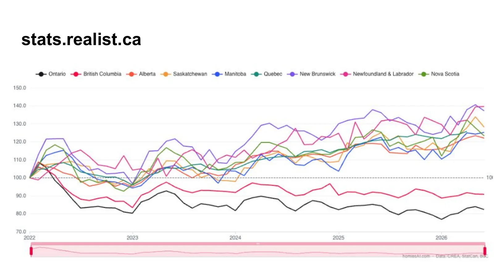
The Realist index shows strength in several smaller provinces while British Columbia and Ontario remain below their January 2022 index levels.
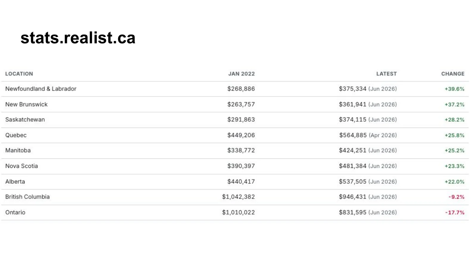
The table turns the indexed chart into dollar values and percentage changes by province.
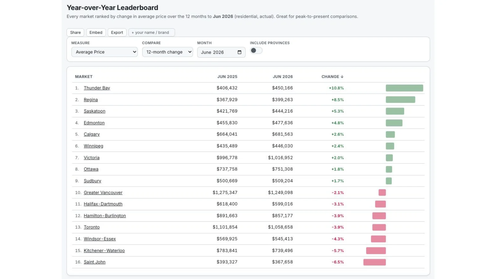
June 2026 year-over-year price changes show strong gains in several Prairie and Atlantic markets and declines in parts of Ontario and British Columbia.
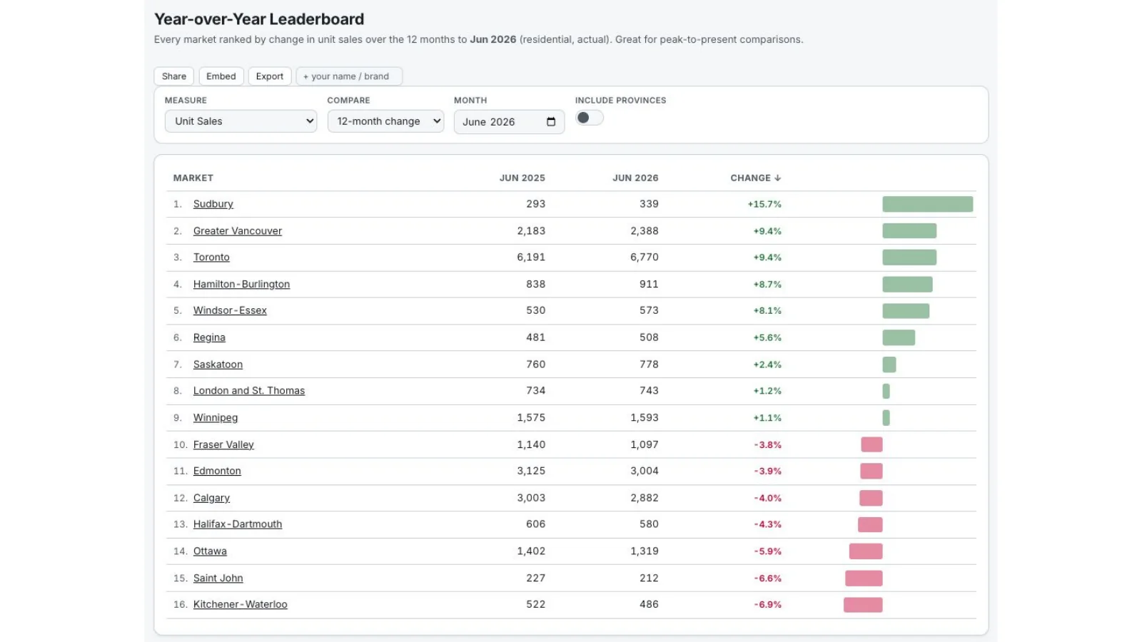
Sales growth was concentrated in a handful of markets, while several major regions remained below June 2025 levels.
Canada is building a renter economy in real time
The condo pipeline is rolling over while purpose-built rental construction reaches records. That is not a short-lived substitute for ownership; it is a structural change in housing tenure and in the real-estate work surrounding it.
The most important supply chart in the deck is the national stock of dwellings under construction. Rental construction has risen to a record while the condominium pipeline has begun to roll over. That reflects the failure of many recent condo projects to meet presale thresholds, but it also reflects a deliberate pivot by developers and landowners toward purpose-built rental.
The Greater Toronto Area illustrates the shift. Purpose-built rental starts reached a new quarterly record, and several suburban markets have an unusually large share of their existing rental stock under construction. Developers with entitled land and long pipelines cannot simply stop operating when the investor-condo model weakens. Where financing, density and programs make the economics possible, rental becomes the alternative tenure.
That future supply matters when people forecast rent growth. Canada may return to faster population growth later, and ownership may remain inaccessible to many households, both of which support rental demand. But a record construction pipeline can meet part of that demand. The correct thesis is not that every new renter guarantees unlimited rent inflation. It is that a much larger rental sector is being institutionalized, with local outcomes determined by completions, absorption, incomes and population.
This is also a business-model signal for Realtors. Leasing is often treated as a temporary or junior service on the way to a purchase transaction. In a market where clients rent longer and large purpose-built landlords need distribution, tenant qualification and ongoing turnover, leasing becomes a durable specialty. Agents can build relationships with institutional owners, operate high-volume leasing systems and remain connected to households whose path to ownership may take years.
A renter economy is not automatically a social failure. Renting can offer flexibility and preserve capital for other uses. Ownership still has a powerful advantage as forced saving for households that would not otherwise invest the difference, and a primary residence can provide long-term stability. The point is that the financially correct decision depends on price, rent, tenure length, transaction costs and what the household will actually do with the saved capital.
The opportunity is not just selling the next home. It is serving the much larger rental market being built between now and then.
The resale market is closer to balance than the national rhetoric suggests. Sales-to-new-listings ratios and months of inventory show softer conditions in British Columbia and Ontario than in Alberta, although Alberta has also been slowing from a stronger position. Active listings are above the tightest post-pandemic years, and sales have improved seasonally without recreating the 2022 surge.
Volume is the indicator I am watching first. A durable increase in transactions would suggest price discovery is improving and that the market has found a level where buyers and sellers can meet. But higher volume also draws out new listings, so the price response can lag. In Ontario and British Columbia, a substantial portion of the adjustment has already occurred through lower prices; financing costs may need to do more of the remaining work.
Affordability completes the regional picture. Markets with the highest price-to-income multiples continue to face the largest ownership barrier and the strongest incentive to rent or migrate. More affordable centres have attracted demand and generally produced better recent price performance. The next Canadian housing cycle will be less about a single national forecast and more about following the interaction of local incomes, migration, financing and the type of homes actually being built.
My closing message is practical. Do not wait for the old condo-and-resale cycle to return unchanged. Follow the rental pipeline, learn the leasing business, watch employment before arrears, and distinguish the Canadian rate path from the American one. The market is not frozen; it is reorganizing around affordability and cash flow.
Canada is building a renter economy in real time
Every chart is preserved from the presentation. Open the linked publisher or primary source beneath each image for methodology and current data.
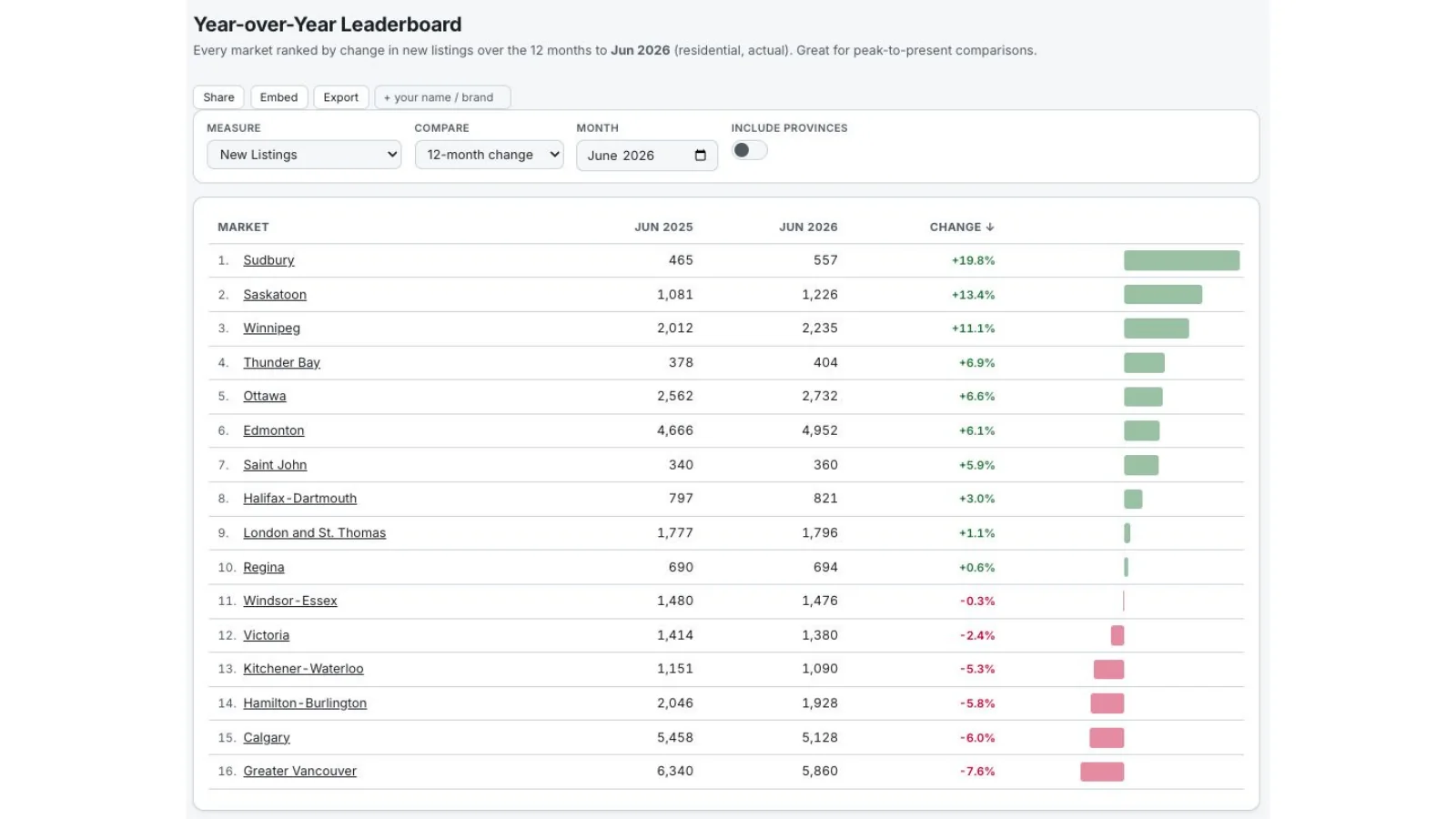
New-listing growth varied sharply by market, reinforcing the need to separate national headlines from local inventory conditions.
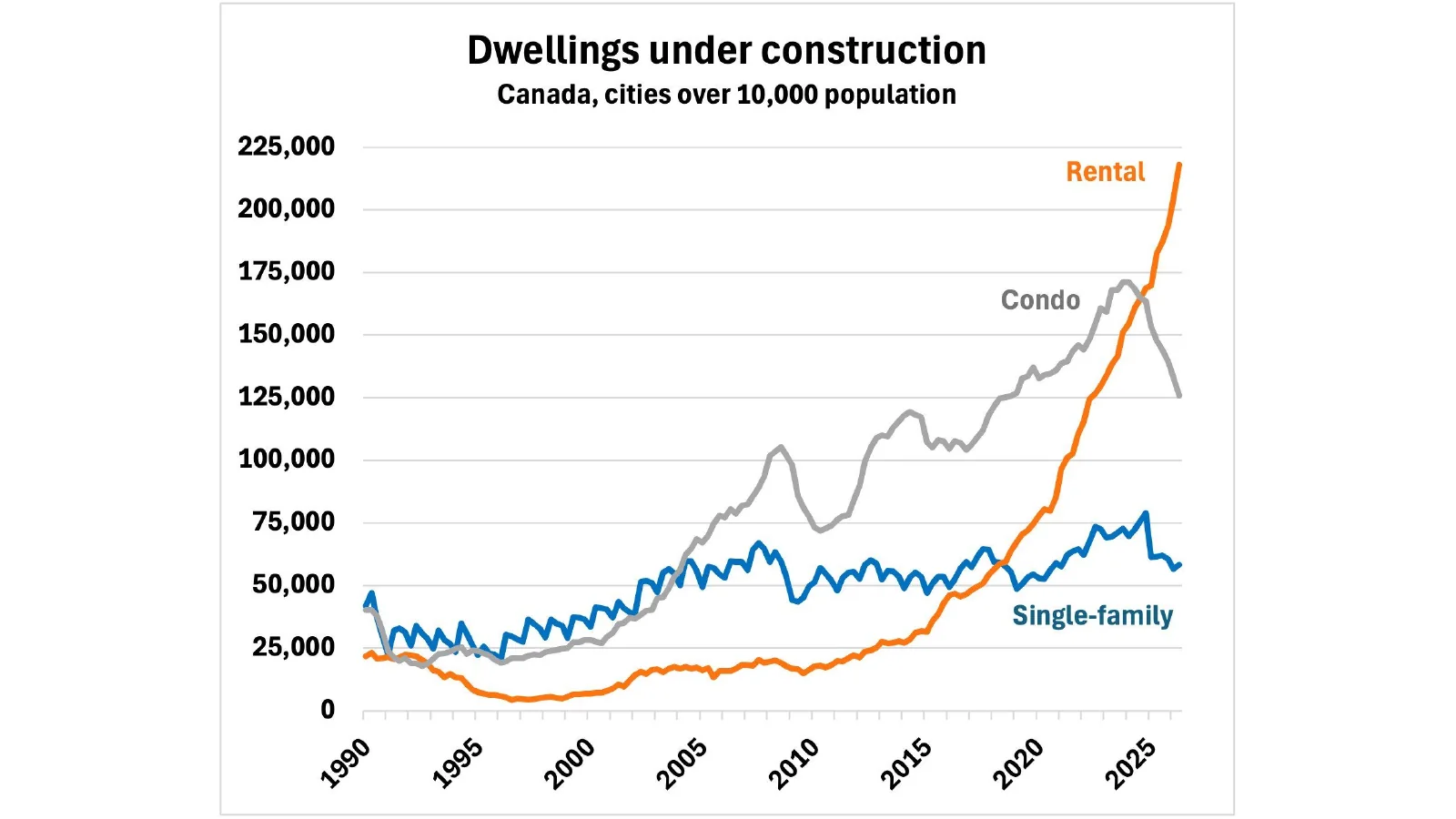
Across Canadian cities above 10,000 population, rental dwellings under construction have risen to a record while the condo pipeline has rolled over.
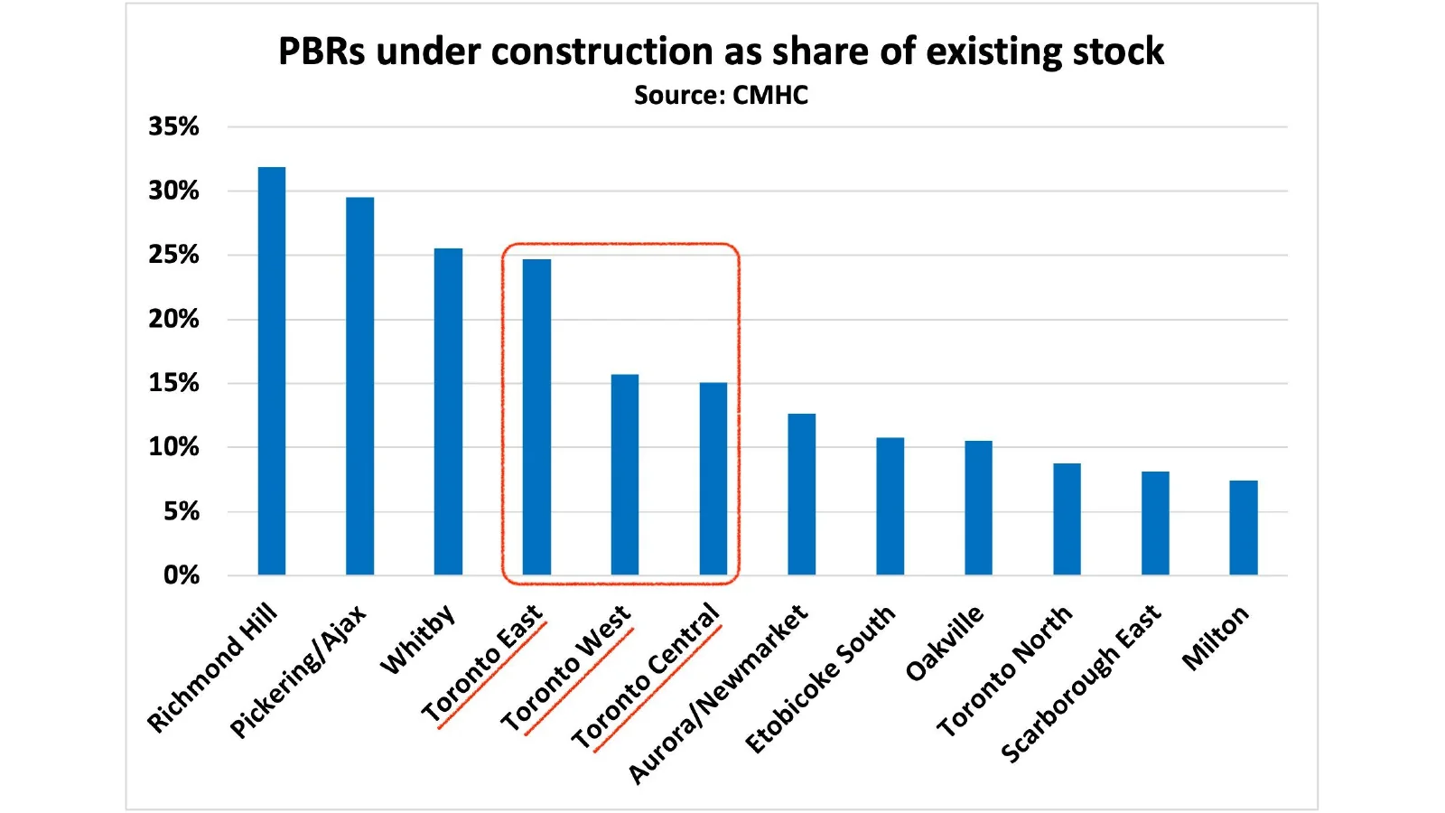
The share of rental stock under construction is highest in Richmond Hill, Pickering-Ajax and Whitby, with several Toronto-area markets also elevated.
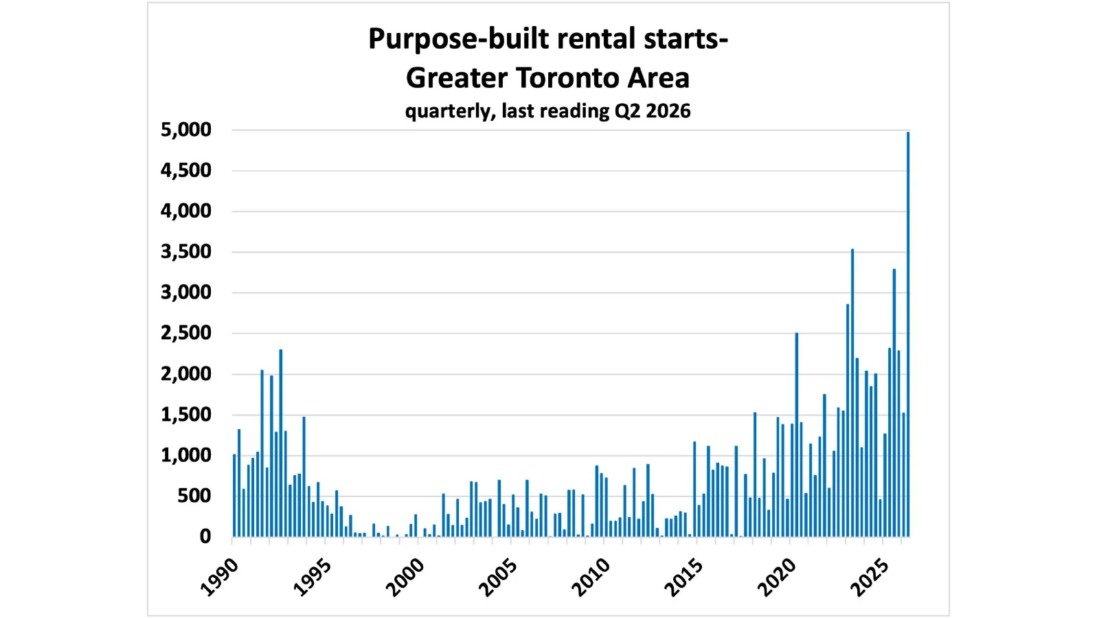
Quarterly purpose-built rental starts in the Greater Toronto Area reached a new high in the second quarter of 2026.
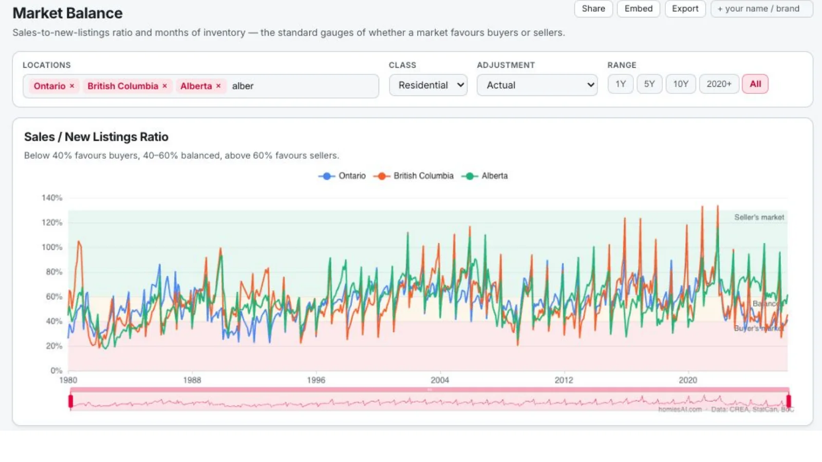
The ratio remains within or near balanced territory nationally, with material differences among Ontario, British Columbia and Alberta.
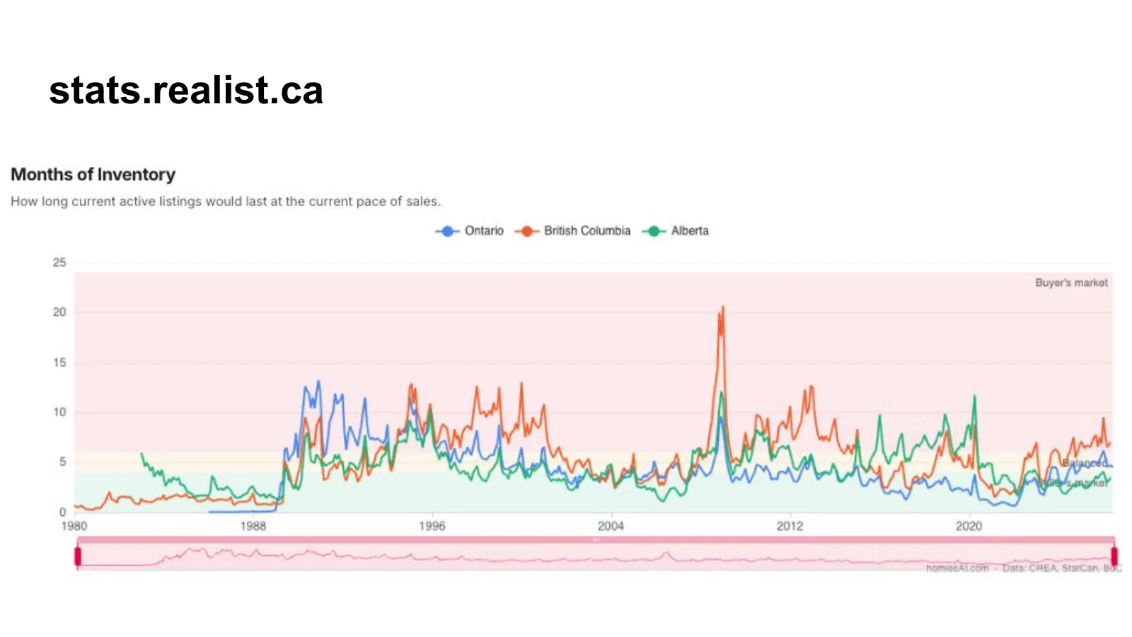
Current inventory would last longer in British Columbia than in Ontario or Alberta at the current pace of sales.
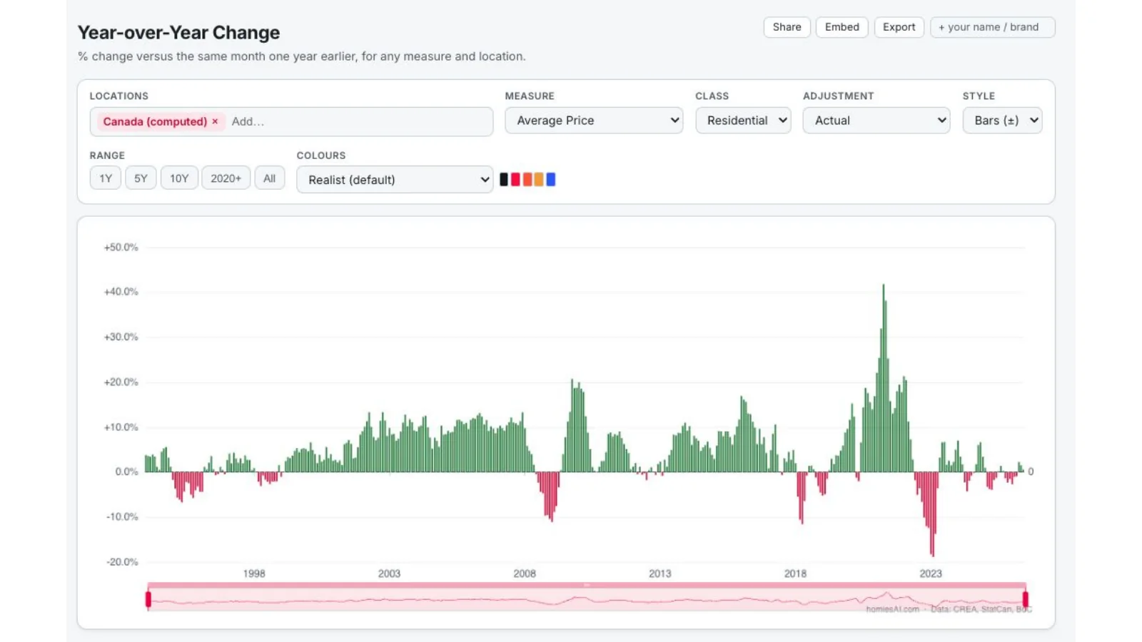
The national year-over-year price series moved around zero in mid-2026 after a volatile post-pandemic cycle.
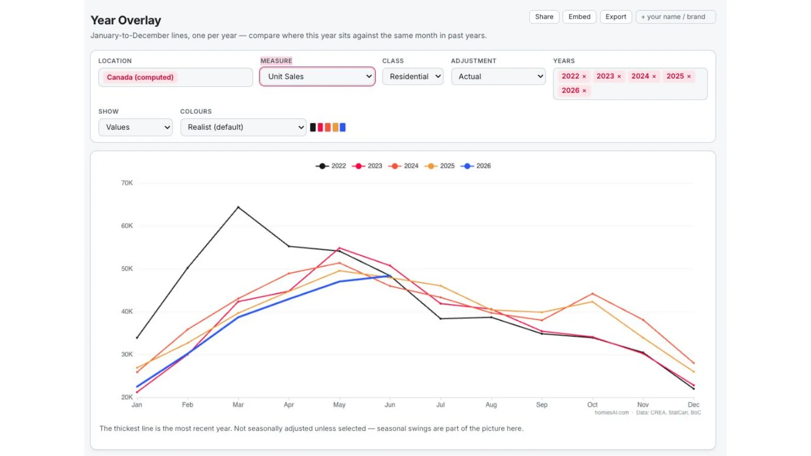
The 2026 national sales path strengthened into late spring but remained below the sharp 2022 peak.
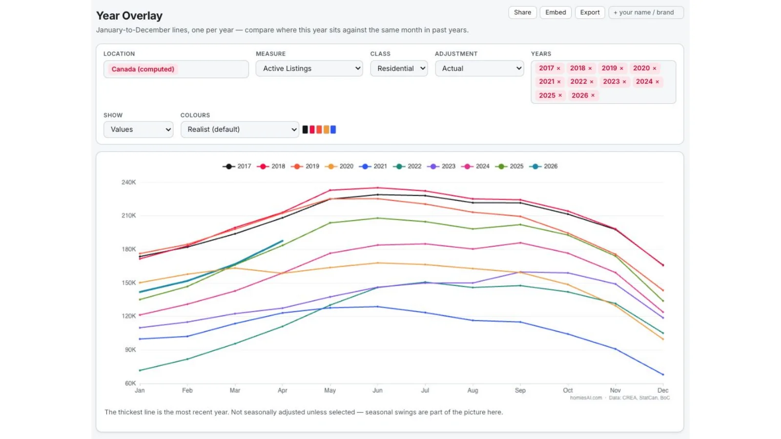
Active listings in 2026 are tracking above recent years, giving buyers more choice than during the tightest post-pandemic periods.
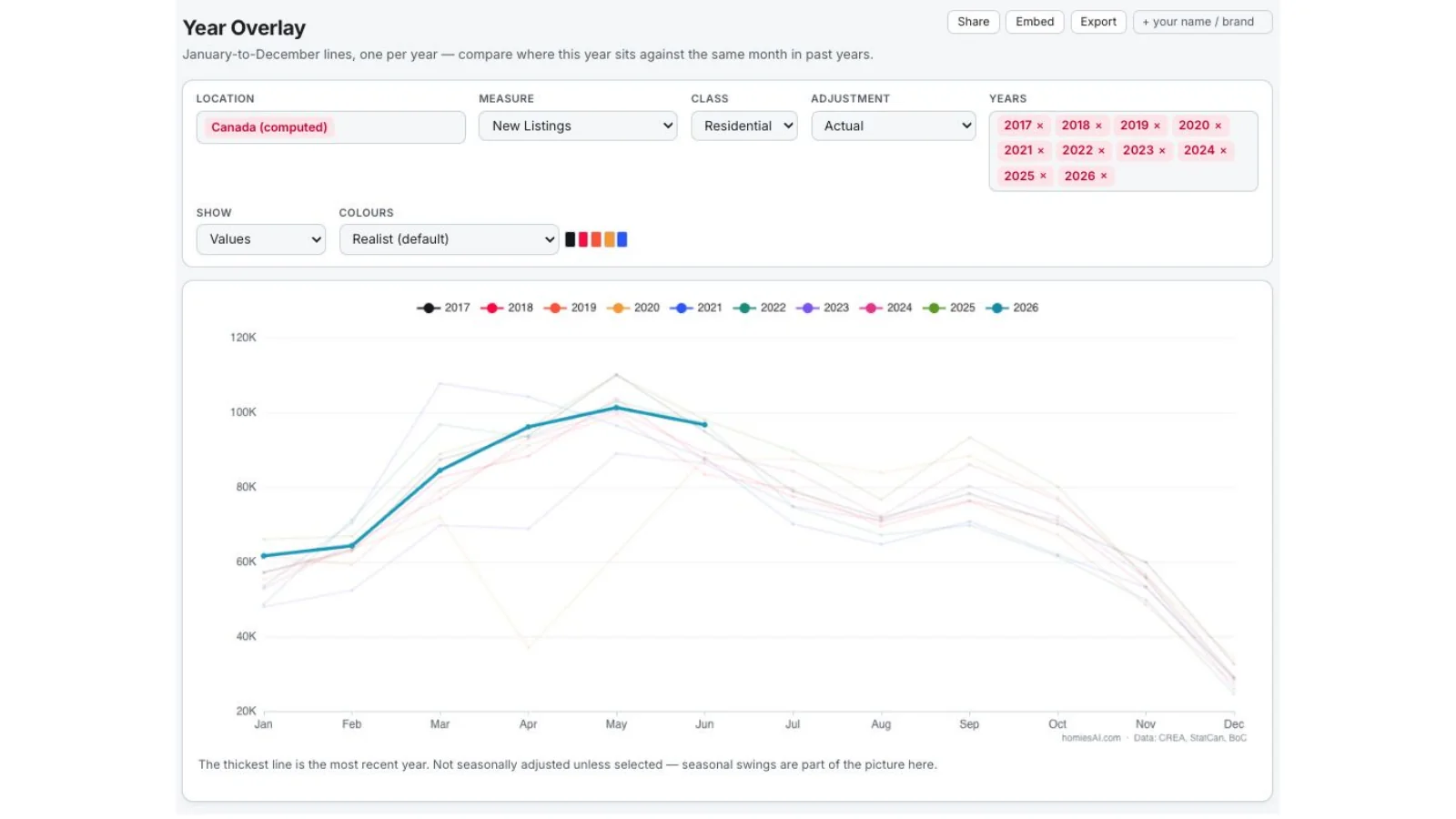
New listings followed the normal spring rise in 2026, with the latest complete month shown against prior-year seasonal paths.
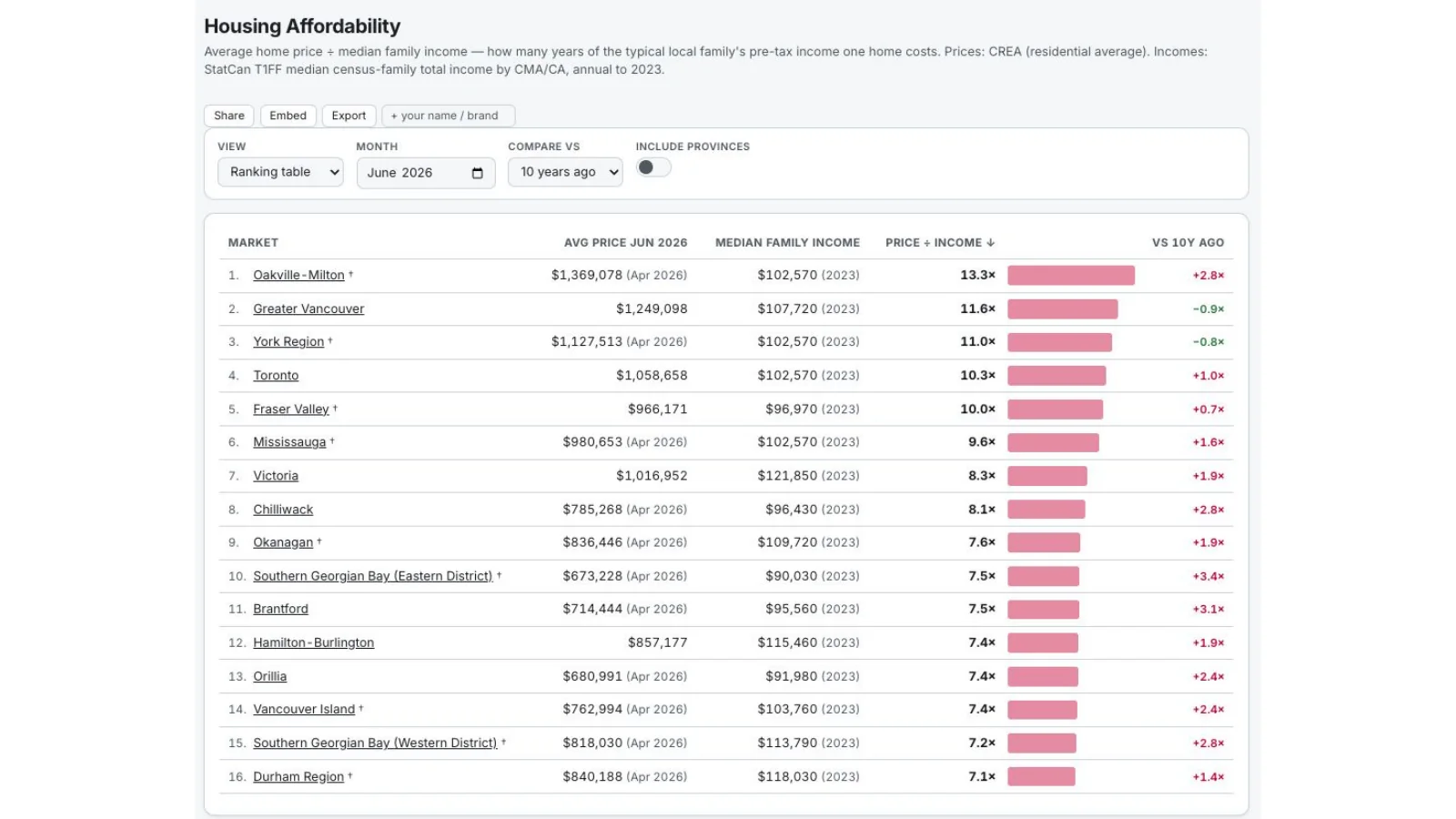
The Realist ranking compares average price with median family income; the most expensive western and Ontario markets require the largest income multiples.
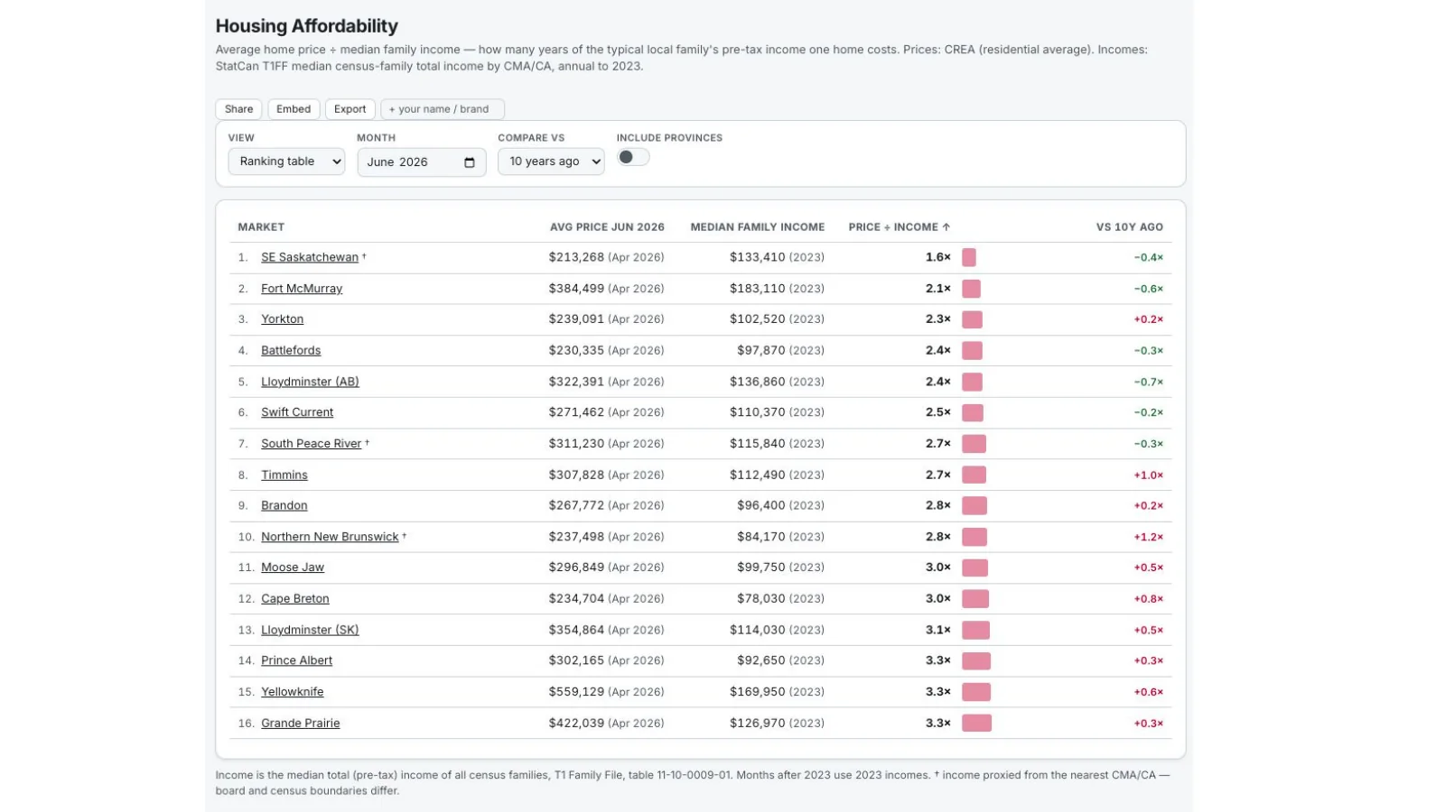
A second Realist ranking shows that lower price-to-income ratios remain available across Saskatchewan, New Brunswick, Manitoba and selected Ontario and Quebec markets.