Toronto's August, in charts you can touch.
TRREB's Market Watch came out September 3. Here it is as an interactive report — every chart live, zoomable and sourced — plus the prompt that rebuilds it for your market and your clients.
Live data
Every chart is the actual Homies Stats series — 2011 to August 2026, updated monthly.
Interactive
Tooltips, zoom, and two series on one chart. No screenshots of PDFs.
Yours
The prompt rebuilds this report for 40+ GTA regions or 100+ Canadian markets — with an optional lead-capture funnel and Instagram assets.
Prompt library
Make your own version of this report
This page was assembled from the same feed any Homie can read. Copy the prompt, paste it into Homies (or any AI with web access), and answer four questions — your market, your audience, whether to gate the full report behind a lead-capture form, and whether you want an Instagram carousel or story to promote it. It writes a report like this one for your own farm area with live embedded charts and this month’s real numbers; choose the two-tier option and it publishes a public 30% preview whose “sign up to read more” box feeds your Homies lead warehouse before revealing the full version. The four-minute walkthrough below runs it end to end — copy, paste, answer, publish — and the chapters under the player jump straight to the part you need. One note: the carousel sizing problem it runs into at “fixing formatting issues” is already fixed in the prompt below, which now takes whatever aspect ratio your image tool supports instead of demanding 4:5.
- 1
Copy the prompt
Hit copy below — it's complete, nothing to fill in first.
- 2
Paste it into Homies
Or any AI with web access. It asks four questions, then waits for you.
- 3
Answer four questions
Market, audience, gated or open, and whether you want Instagram assets. Silence takes the defaults.
- 4
Review, then publish
It writes the report with live charts and stops for your approval before anything is sent or posted.
August 2026
Everyone stepped back in August
GTA REALTORS® reported 5,057 salesthrough TRREB’s MLS® in August 2026 — down 2.1 per cent from August 2025 — at an average price of $993,410, off 2.7 per cent year over year and back below the million-dollar line for only the second month of 2026. But the most striking number is on the other side of the market: sellers brought out 14.1 per cent fewer new listingsthan a year ago, and active inventory fell 11.3 per cent. This wasn’t buyers overwhelming supply or sellers flooding the market — both sides stepped back at once.
Sales
5,057
−2.1% yr/yr
Average price
$993,410
−2.7% yr/yr
Median price
$850,000
−4.2% yr/yr
New listings
12,075
−14.1% yr/yr
Active listings
24,482
−11.3% yr/yr
Days on market (listing)
35
33 a year ago
Listings took 35 days to sell on average, two days longer than last August, and the typical sale still closed at 97 per cent of the asking price. None of these moves is dramatic on its own — the point of the charts below is the shape of the trend, which a monthly press release can’t show.
Prices
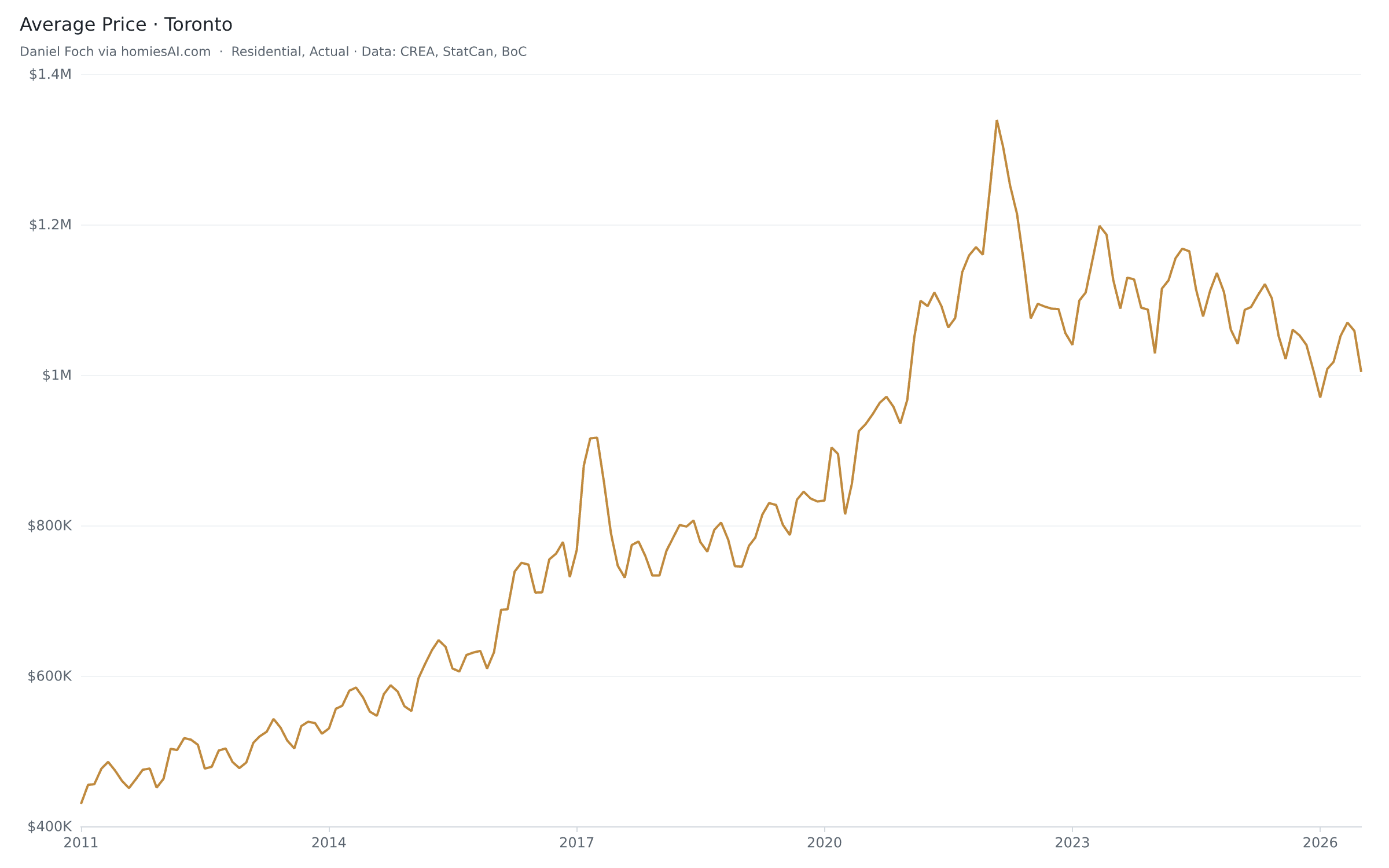
The average GTA home is back under $1 million
At $993,410, the average is down 2.7 per cent from last August, 25.6 per cent below the February 2022 peak of $1,334,544, and under seven figures for the first time since January. The median tells a sharper story: $850,000, down 4.2 per cent year over year. The first chart puts fifteen years of average price and sales on one canvas — drag to zoom into any window. The 2017 spike, the 2022 peak and the long slide since are all visible in a way no single month’s number can convey.
Compare the City of Toronto proper against the board as a whole — the 416 and the 905 have been converging since the peak:
Supply
Sellers pulled back 14% — the market is thinning, not flooding
New listings fell 14.1 per cent year over year to 12,075 and active inventory dropped to 24,482. By the ratios it is still a buyer’s market — the sales-to-new-listings trend sits at 37.5 per cent and months of inventory at 4.6 — but the direction has changed: sellers who don’t have to sell are withdrawing rather than chasing the price down. A market that thins out on both sides is how price floors form; watch the months-of-inventory line below for the turn.
Home types
Every home type is cheaper than a year ago
The split by home type is where the GTA story gets specific. Detached homes held up best, averaging $1,288,669 board-wide (−1.8 per cent year over year), while the condo segments led the decline: condo apartments averaged $617,593 (−3.8 per cent) and condo townhouses fell 7.8 per cent. Toggle measures and types in the live view:
Context
The rate backdrop is doing the heavy lifting
August’s modest recovery didn’t happen in a vacuum — the Bank of Canada’s overnight rate sat at 2.25 per cent through the month, and the posted five-year mortgage rate, at 6.09 per cent, is well off its late-2023 peak above 7 per cent. The chart below overlays Toronto’s average price against the 5-year mortgage rate (inverted, so cheaper money plots upward) — the relationship that has driven every turn in this market since 2017:
On camera
The full chart set, in running order
Everything above, plus the cuts that don’t fit the written story — the seven visuals for this month’s market video, in the order they’re narrated. Every chart is live, so this page is current the morning you record it: scroll it top to bottom on screen share, or open any chart on its own for a full-bleed shot.
Sales vs. new listings — the thesis chart
Sales −2.1%. New listings −14.1%.
Both sides stepped back, but sellers stepped back seven times harder. That gap is the whole month.
Active listings and months of inventory
24,482 active listings (−11.0%) · 4.6 months
Inventory is draining, but 4.6 months still sits in the balanced band — shaded on the chart.
MLS® HPI composite benchmark, year over year
Benchmark $925,900 · −4.5% YoY
The benchmark home — quality-adjusted, not mix-skewed — is still falling faster than the average price suggests.
Average price vs. benchmark — why they disagree
Average $993,410 (−2.8%) vs. benchmark $925,900 (−4.5%)
The average is a mix of what sold; the benchmark is the same house every month. When cheap homes stop selling, the average flatters the market.
The 416 split by home type
Detached +0.1% · condo apt −2.4% · att/row town −9.4%
Inside Toronto, detached held flat and townhouses took the damage — the opposite of the story people expect.
The whole GTA by home type, for contrast
Detached −1.8% · semi −4.9% · condo town −7.8%
Board-wide, every type is down. Put this beside the 416 chart and Toronto's detached resilience pops.
Farm cut — Georgina, East Gwillimbury, Newmarket
Newmarket +5.3% · Georgina −4.4% · East Gwillimbury −13.1%
Three towns, twenty minutes apart, moving in opposite directions. This is why board-level averages are useless to a seller on one street.
Sales-to-new-listings — balanced, not a frenzy
37.5% (trend) · 34.5% a year ago
Below 40% is buyer's territory, above 60% is a seller's market. We're tightening, but we're not there.
One honest gap: TRREB publishes a seasonally adjusted month-over-month HPI change, but the public feed carries the unadjusted benchmark, so chart 3 shows the year-over-year line rather than the seasonally adjusted monthly move. Quote the −4.5% and leave the month-over-month to TRREB’s release text.
Method
Method & sources
Headline figures are from the Toronto Regional Real Estate Board’s Market Watch release for August 2026 (published September 3, 2026). Charts are live embeds of the Homies Stats TRREB explorer , which parses every Market Watch back to January 2011 into machine-readable series — 41 regions, five home types, eleven measures. Mortgage-rate context is Bank of Canada data via the same feed. One nuance worth knowing: TRREB’s release compares August 2026 against a revisedAugust 2025 (5,168 sales, $1,021,300 average), while the charts plot each month as it was first reported — so chart-computed year-over-year changes can differ from the release’s by a fraction of a point.
Planning and legal notice
TRREB® and Market Watch are trademarks of the Toronto Regional Real Estate Board. This independent analysis is not affiliated with or endorsed by TRREB. Data is provided for information, not as investment advice.